 Back to my works
 For quick task updates

Elixir Master
A story of unifying workflows in a fragmented organization
A desktop application for managing employees, clients, firms, tasks, and file uploads. An all-in-one internal operations hub designed to bring control, clarity, and efficiency across the board.

My Role
UX Research & Product Design

Duration
3 months

Team
Tech Head
2 Developers

Impact
Smart Internal Operations Platform
Introduction
Let me take you behind the scenes of one of the most satisfying and complex projects I've worked on
When I first connected with Elixir, a professional services firm handling tax and financial filings, they weren't strangers to digital tools. They had systems in place for managing clients, employees, and partner firms.
But something was off.
There was no proper system for managing tasks or files, and the existing modules operated in isolation. Nothing really talked to each other.

"We just want to manage everything in one place... and not overthink it."
That's what I set out to build: A centralized internal application that not only brought together clients, firms, employees, tasks, and files, but also introduced role-based access, smart logic, and a UI designed for clarity and speed, all under one seamless interface.
About Elixir
Elixir is a growing audit and compliance services firm based in Chennai, India. They specialize in handling critical processes like tax filing, audit documentation, ROC compliance, and financial submissions for their clients, many of whom are well-known firms and startups across sectors.
Their work involves high-stakes paperwork, strict deadlines, and a massive volume of client communication. Yet their internal systems were stitched together with spreadsheets, chat threads, and makeshift tools.
Setting the Stage: What Was Broken
When I first met the folks at Elixir, I knew this wasn't a case of 'we need an app.'
They already had software, lots of it.
Tool 1One tool for clients
Tool 2Another for employees
SpreadsheetsFor tasks
Folder TreesThat needed a map to navigate
"We just want to manage everything in one place... and not overthink it."
That was the challenge:
Create one application to rule them all, without making it overwhelming. Something simple, clean, and intuitive, with just the right amount of power under the hood.
The Design Approach: Looping Into Clarity
The team didn't need a full product squad. What they needed was a designer to step in, understand their real pain points, and bring everything together with clarity.I joined as the solo UX/UI designer. And from Day 1, I approached this project not in a straight line, but in loops.
Weekly feedback, early prototypes, shared whiteboards, everything was designed in collaboration, tested early, and shaped around real conversations with the team.
Laying the Foundation: Before Features, the Frame
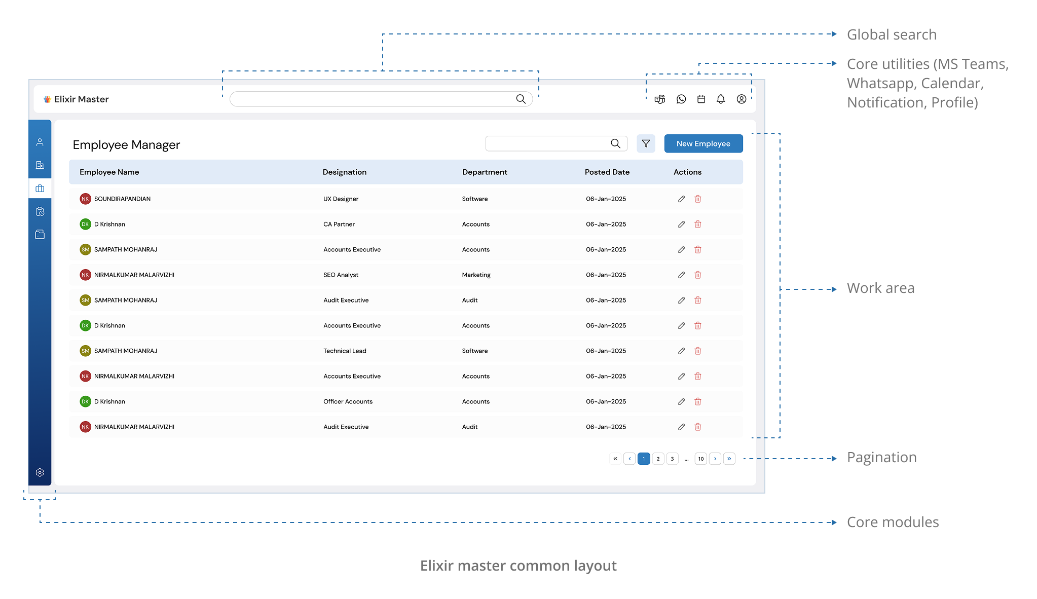
Before I jumped into modules and features, I focused on building the skeleton.Elixir's operations were complex, with constant back-and-forth between clients, employees, and partner firms. So I placed core utilities up top:

WhatsApp Integration

Microsoft Teams Alerts
For internal task notifications

Global Calendar View
To track deadlines and compliance

Universal Search
To find any file, person, or task instantly

Role-based Profile Access
So every user sees only what they need

Prototyping & Testing
For updates and application notifications
On the left, I designed a slim, clean sidebar housing 6 main modules: Employee Manager, Client Manager, Firm Manager, Task Manager, File Manager, and Settings.
Connected Entities, Unified UX
One Layout. Three Modules. Zero Cognitive Load.While designing the Employee, Client, and Firm Managers, I noticed something early: They all served the same primary functions, view, edit, enroll, and link. Yet in legacy tools, they each looked and behaved differently, leading to confusion, context-switching, and unnecessary friction.
 My Solution: Standardized Interaction Model
I designed all three modules, Employee, Client, and Firm Managers, using the same intuitive layout, so users could switch between them without re-learning the UI.
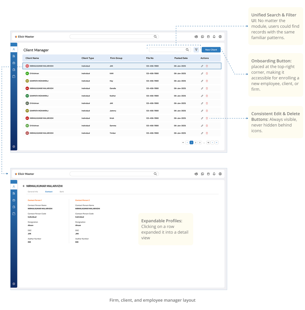
This unified structure wasn't just about UI, it was about reducing cognitive load. When everything works the same way, you don't waste time thinking about how to use it, you just do.
Task Manager
This is where things got really smart. The task manager wasn't just a simple to-do list, it was an entire system in itself.
Challenge:

"Our tasks aren't just tasks, they're multi-layered workflows."
Elixir needed a way to configure everything from teams to compliance categories, define services, create tasks, and finally map those tasks to employees.
My Solution:
A Modular Task Management SystemSo I broke it down and rebuilt it as a structured, modular experience.
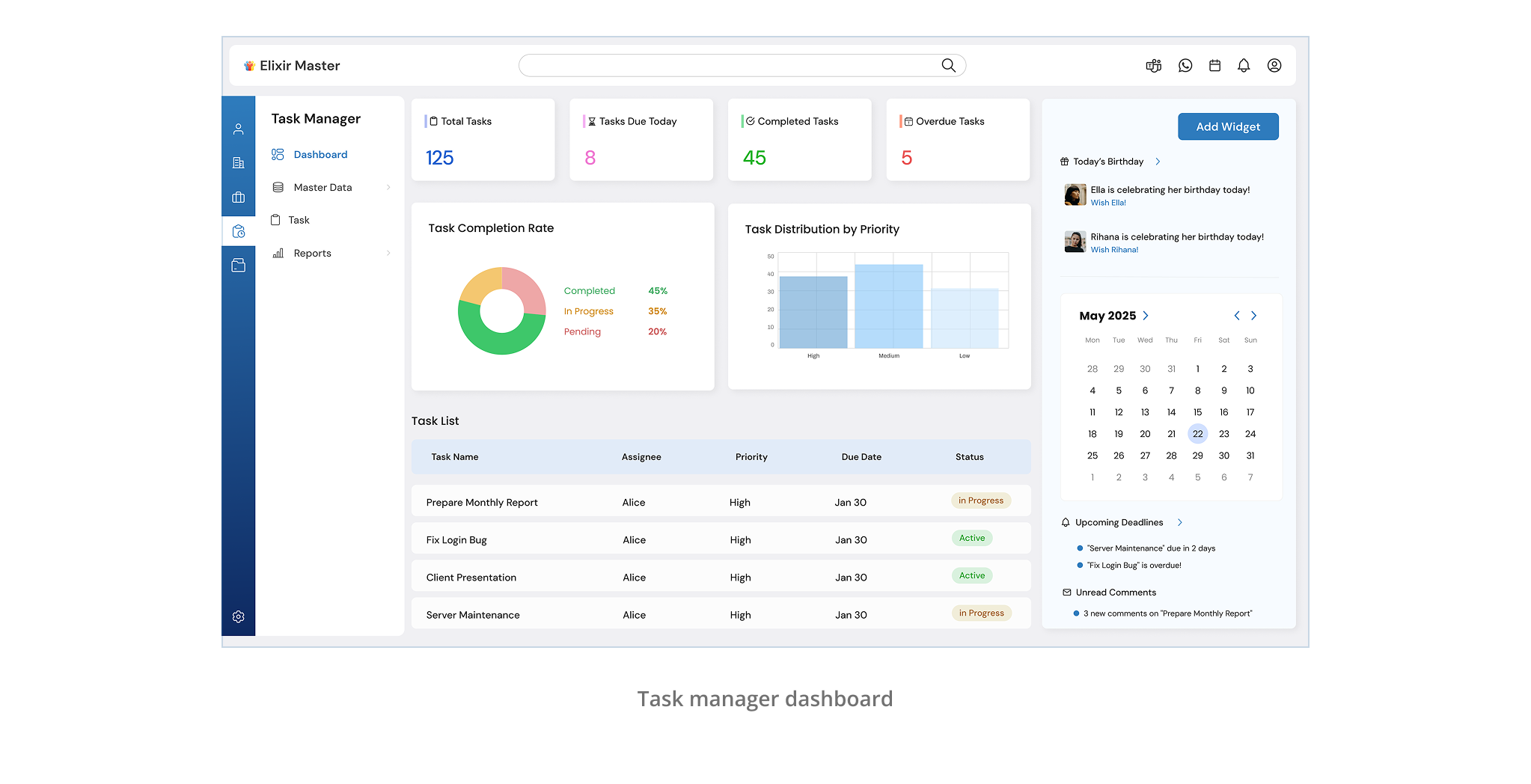
I introduced a sub-menu under Task Manager, starting with a dashboard.
Dashboard
This gave heads of departments a quick glance at overall task statuses, upcoming deadlines, and workloads.
Next came the configuration screens, split into five distinct sections:
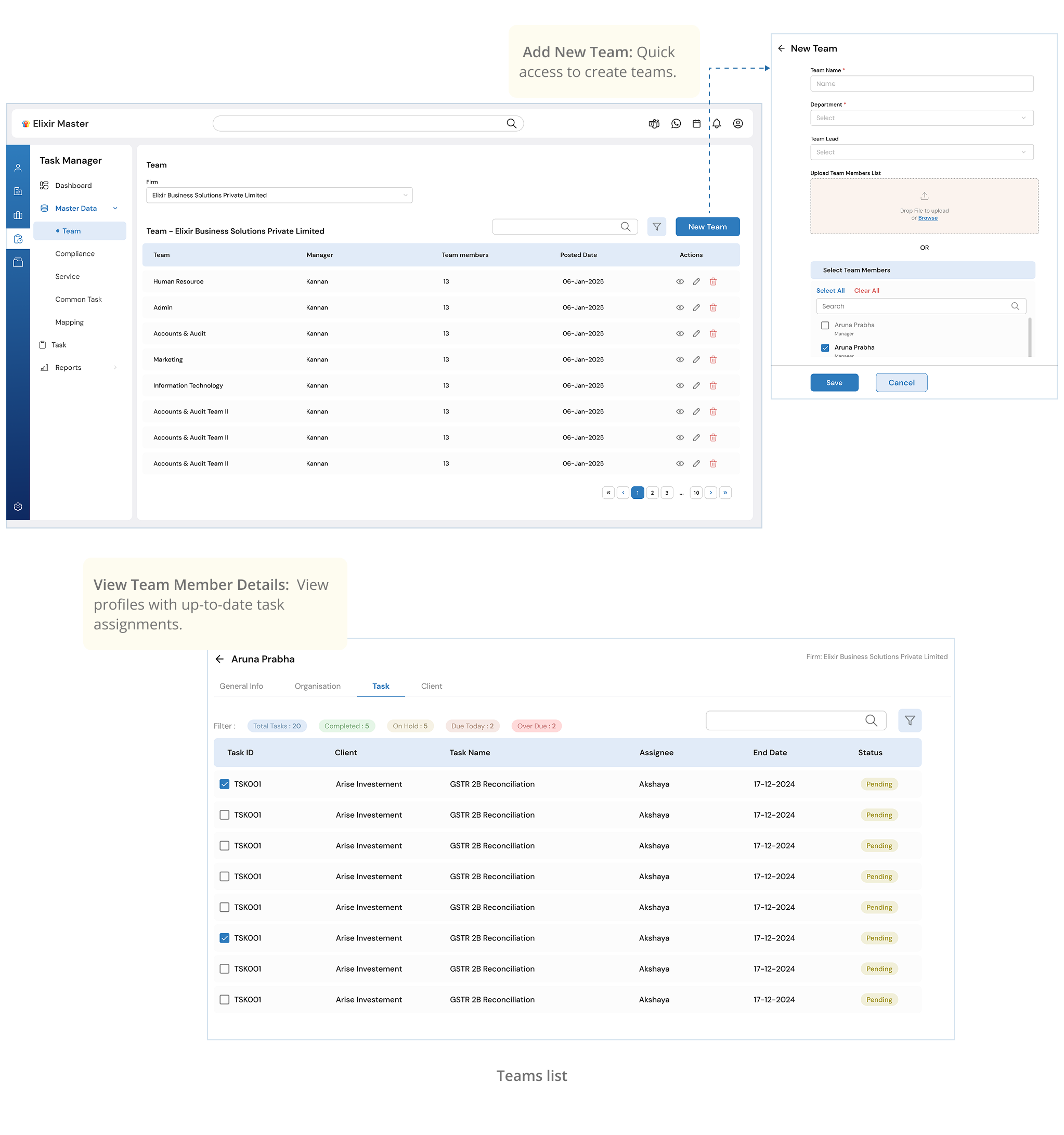
Teams
A list of teams with their managers and members, with options to add, edit, or remove entries.
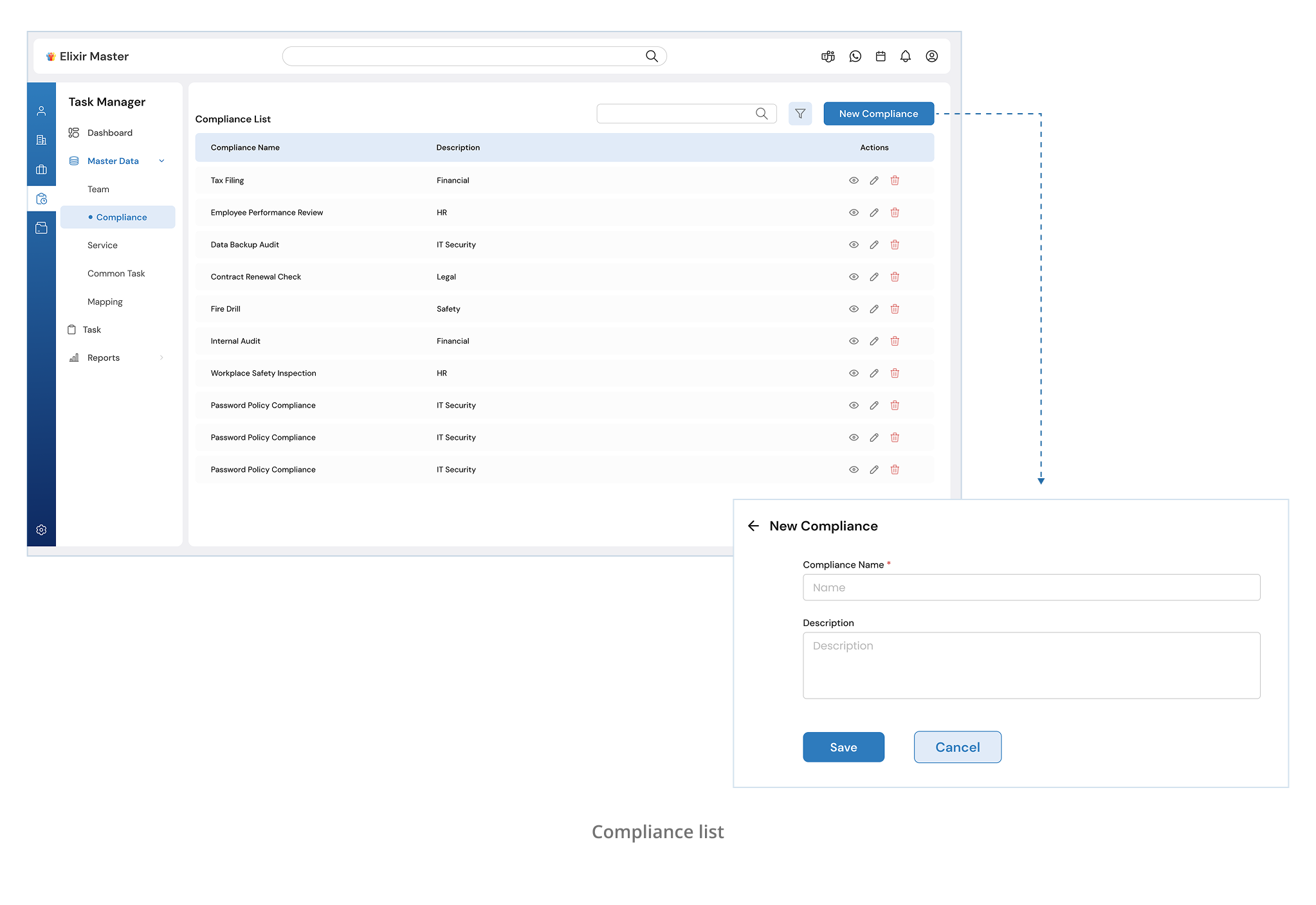
Compliance
Each compliance category acts as a container for services. I kept this screen simple, just the name and description, so it's easy to maintain.
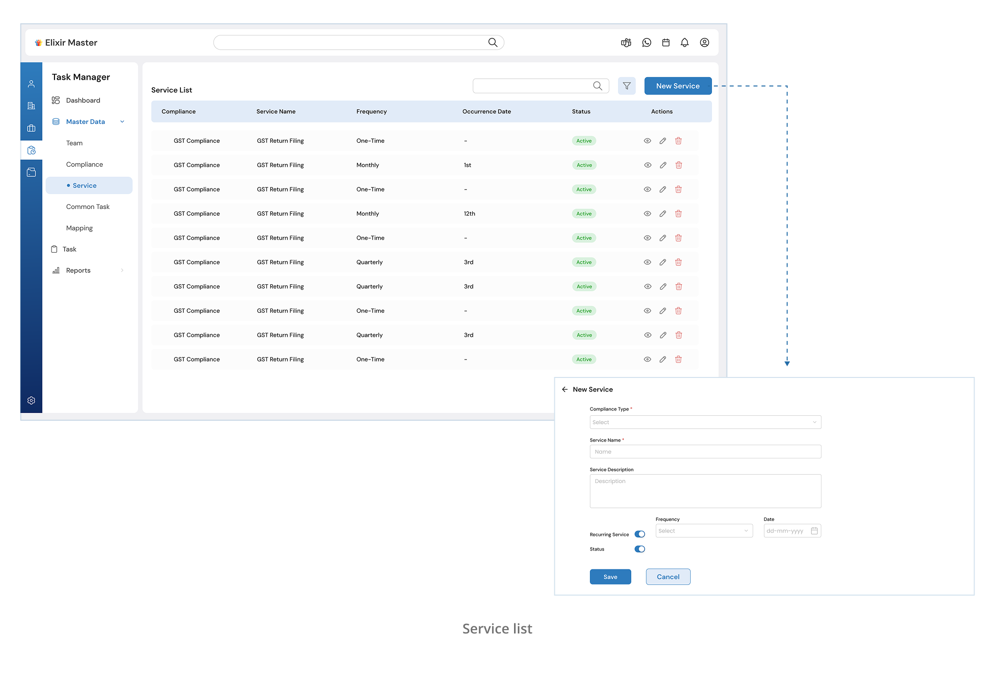
Services
Tied to compliance categories, this is where users define service-level information. If a service is recurring (like monthly filings), they can toggle that on and configure its cycle.
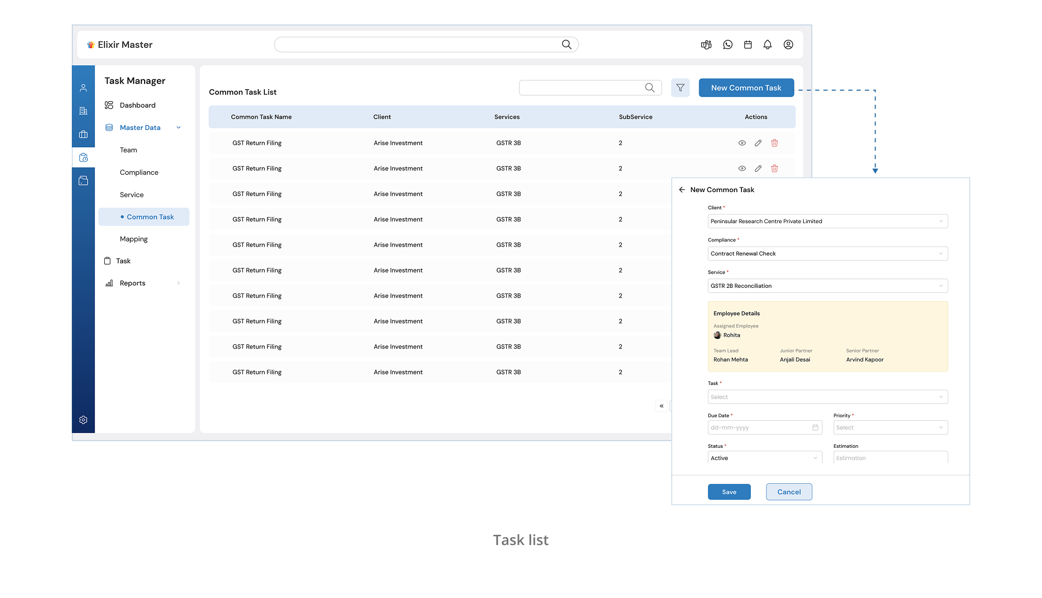
Tasks
For each service, admins can create detailed task templates, including rules and required inputs.
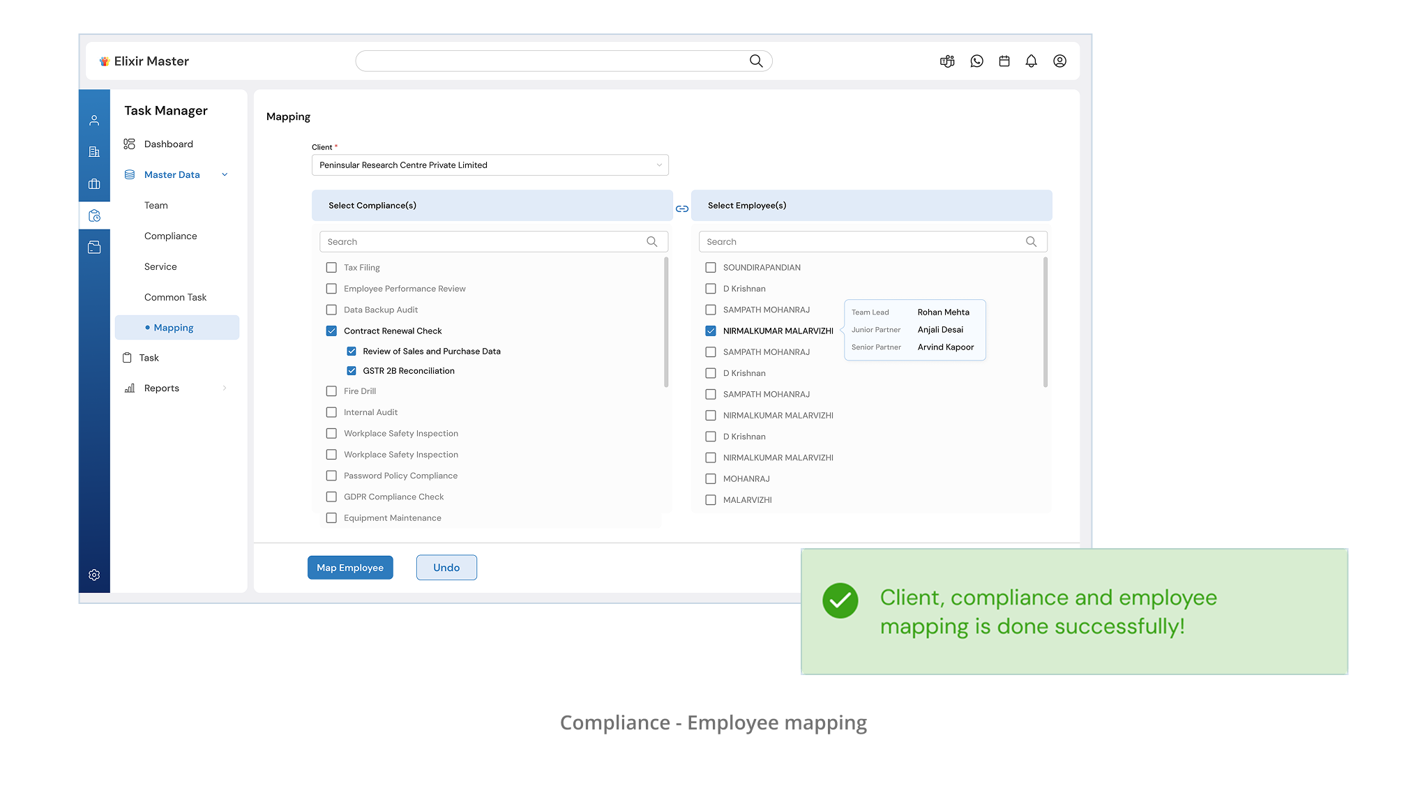
Mapping
The final step, assigning tasks to employees using a dual-box selector that made it visually clear who was working on what.
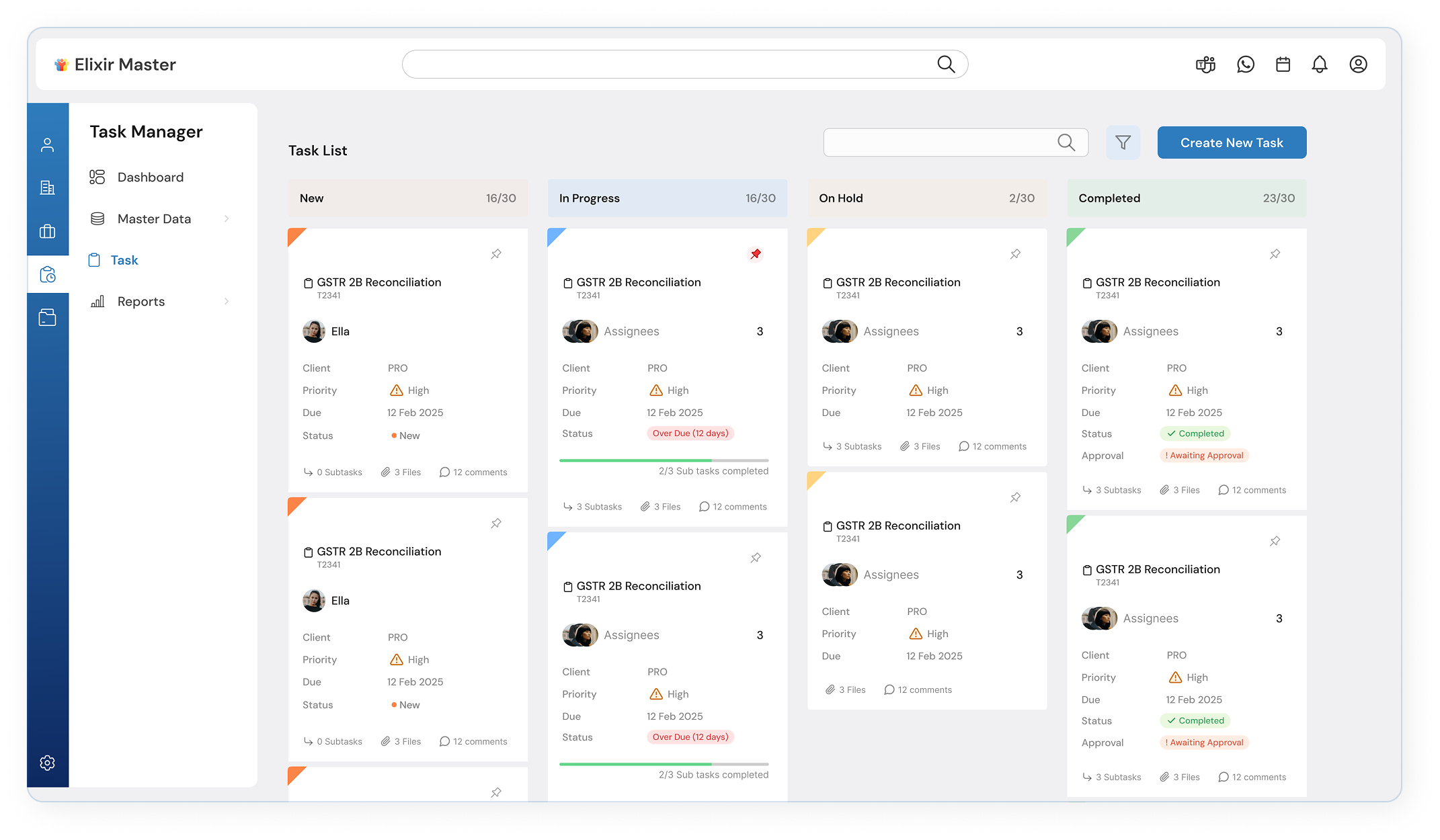
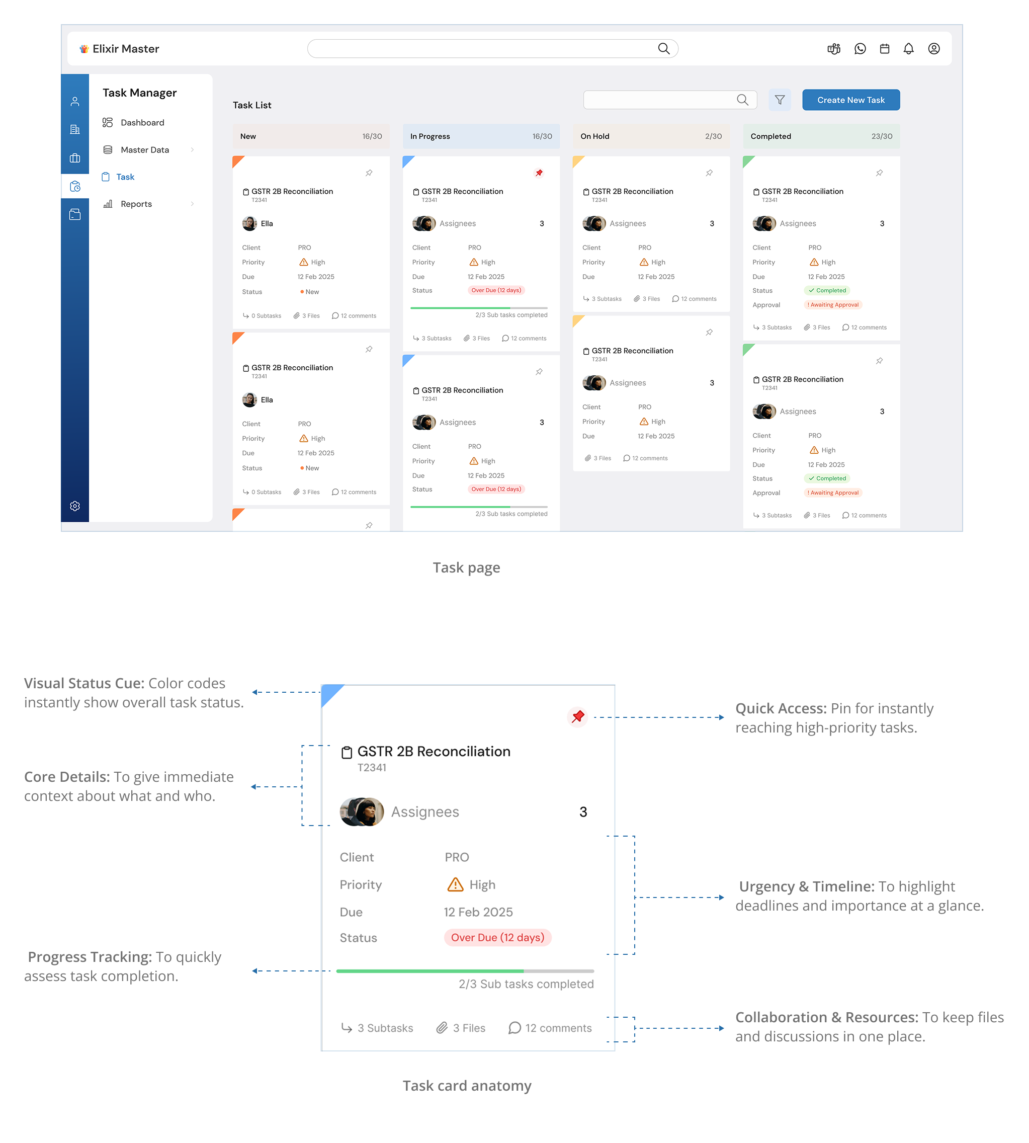
Once configuration was complete, it was time to visualize the actual tasks. This was a challenge. Elixir had dozens of tasks in progress at any given time. So I introduced status-based segmentation: New, In Progress, On Hold, and Completed.
Each task was shown as a card (Kanban board), carefully designed to display just the most essential information, like client name, service, due date, and priority, using color-coded tags and a visual progress bar to indicate completion. Clicking a card revealed full task details and enabled internal comments, so teams could coordinate without leaving the system.
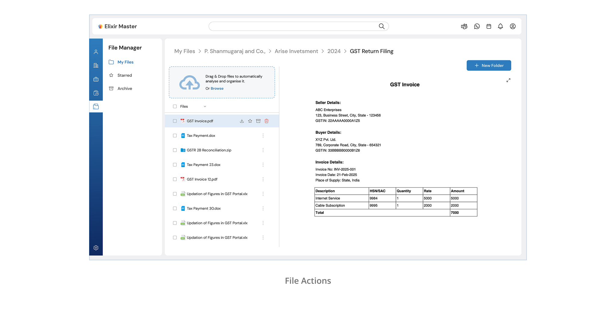
File Manager
Challenge:
"One misplaced file, and it's like it never existed."
"We're wasting hours just trying to find documents we already uploaded."
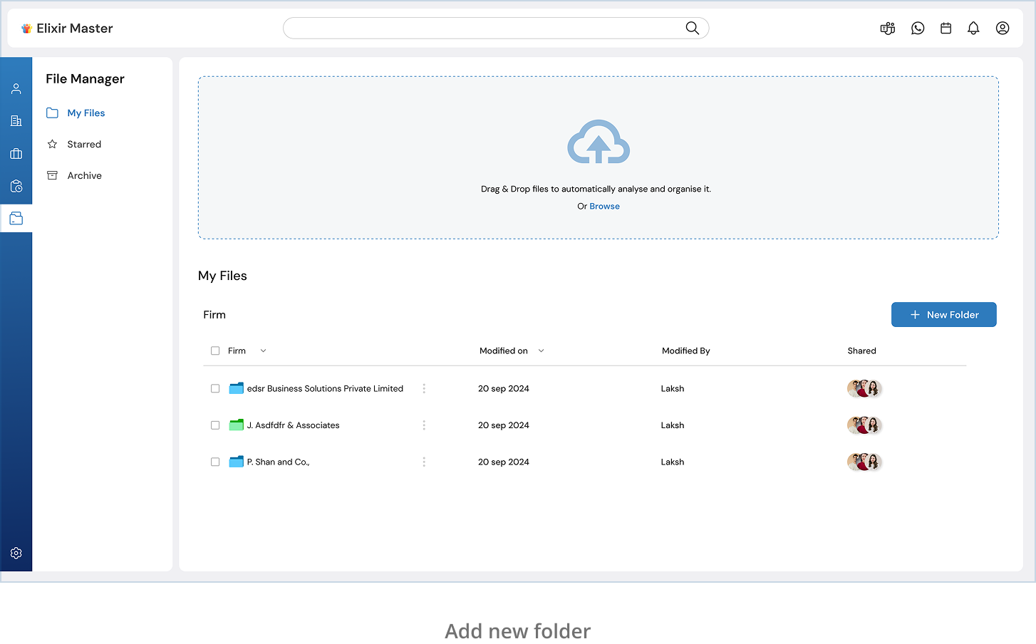
Elixir teams handled hundreds of documents every month, GST filings, compliance reports, audit receipts, and more. But the file storage system was entirely manual: users had to create folders by firm, client, year, and service… every single time.
Just one wrong folder or missing field, and the file became nearly untraceable.
The problem wasn't effort, it was fragility in the process.
My Solution:
AI-assisted uploads with structured automation.I designed a file manager that thinks with the user, not just stores what they upload.
Here's what I changed:
Smart Metadata Reading
When a file is uploaded, the system reads its name and metadata, client name, service, year and automatically suggests a folder path.
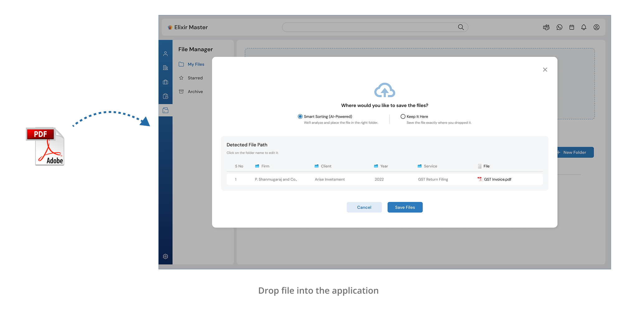
Auto-folder Creation
If the suggested path doesn't exist? It creates it. The user simply confirms placement.
Client Notification via WhatsApp
As soon as a file is uploaded and confirmed, the client gets an instant WhatsApp alert. No one has to chase documents anymore.

Easy File Actions
View, download, star, archive, or delete, everything was made simple and clean, right from the file list.
Refinements Along the Way
As we progressed, every review session with the Elixir team brought fresh insights. Instead of waiting until the end, we baked feedback directly into the design process.
Employee Manager: Added Context for Better Decision-Making
Before:
Employee profiles only showed basic details and assigned tasks.
After Feedback:
Contact information, Department, Organizational hierarchy (who reports to whom) added.
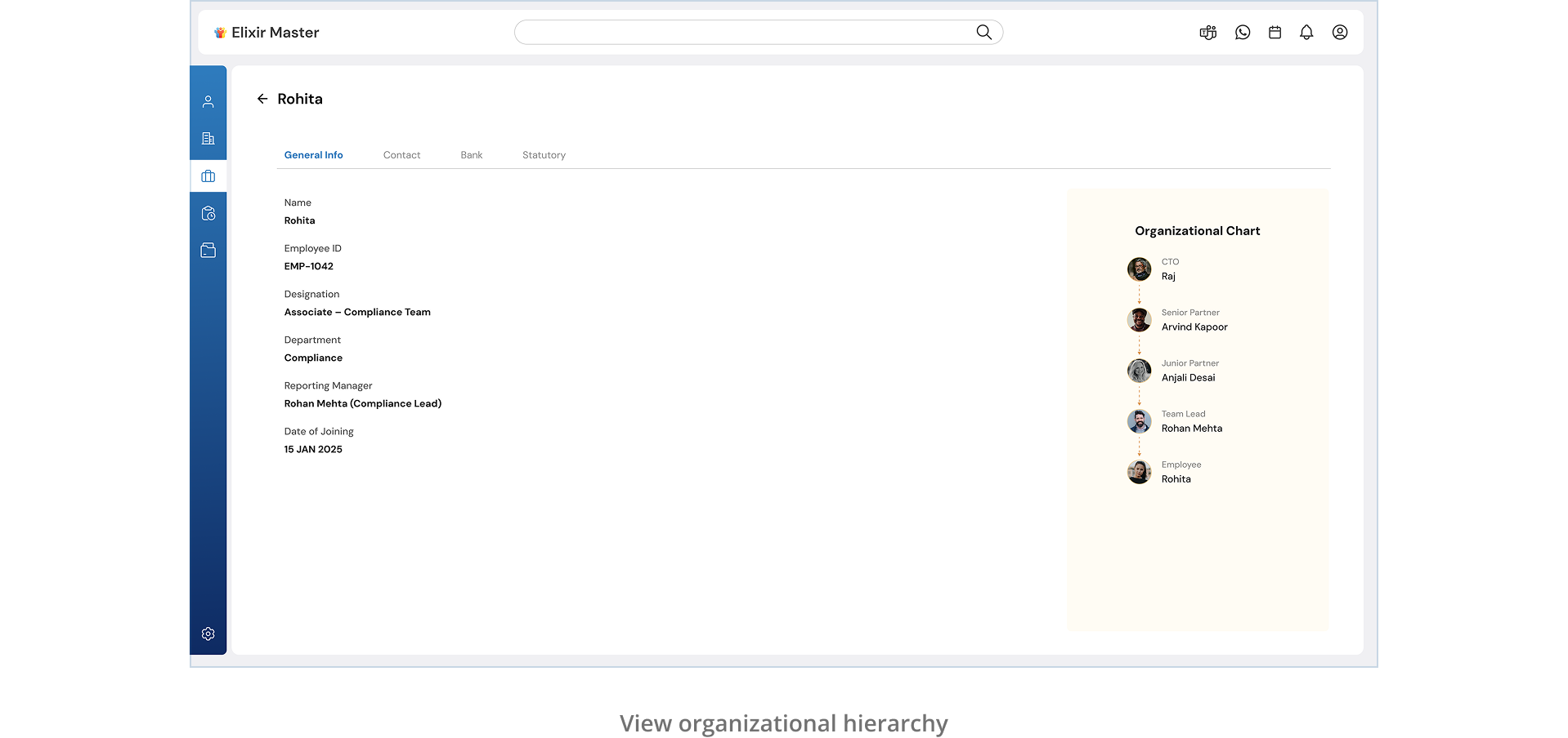
Why it mattered: Gave senior managers a clear, quick view of each employee's place in the org, without needing extra tools.
Task Manager: Employee Snapshot Inside the Task
"We want to see who's involved in the task, without clicking away."
After Update:
Added a compact employee card inside the task detail view, shows name, role, and quick info.
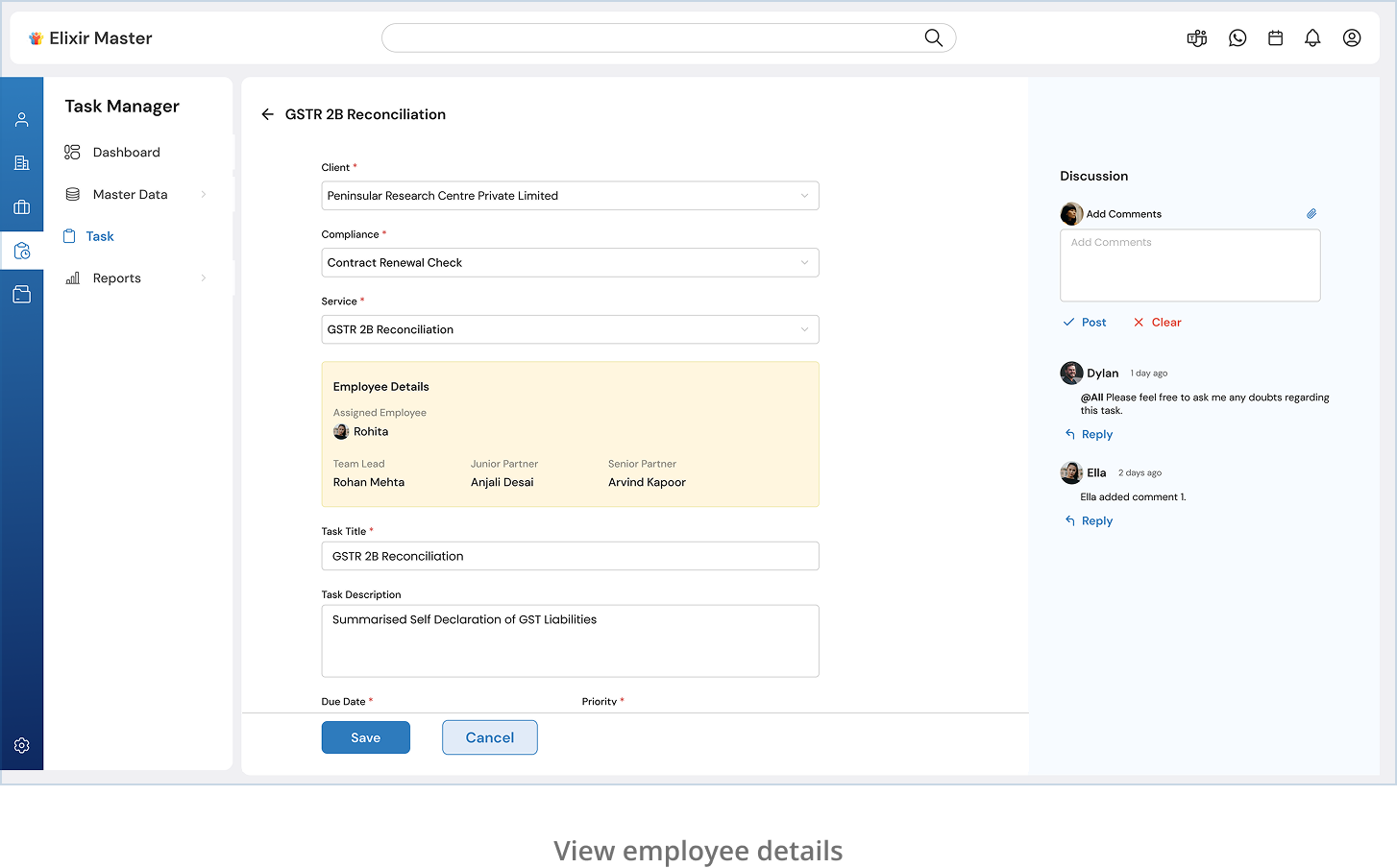
Why it mattered: Saved time and clicks, giving managers instant clarity on task ownership.
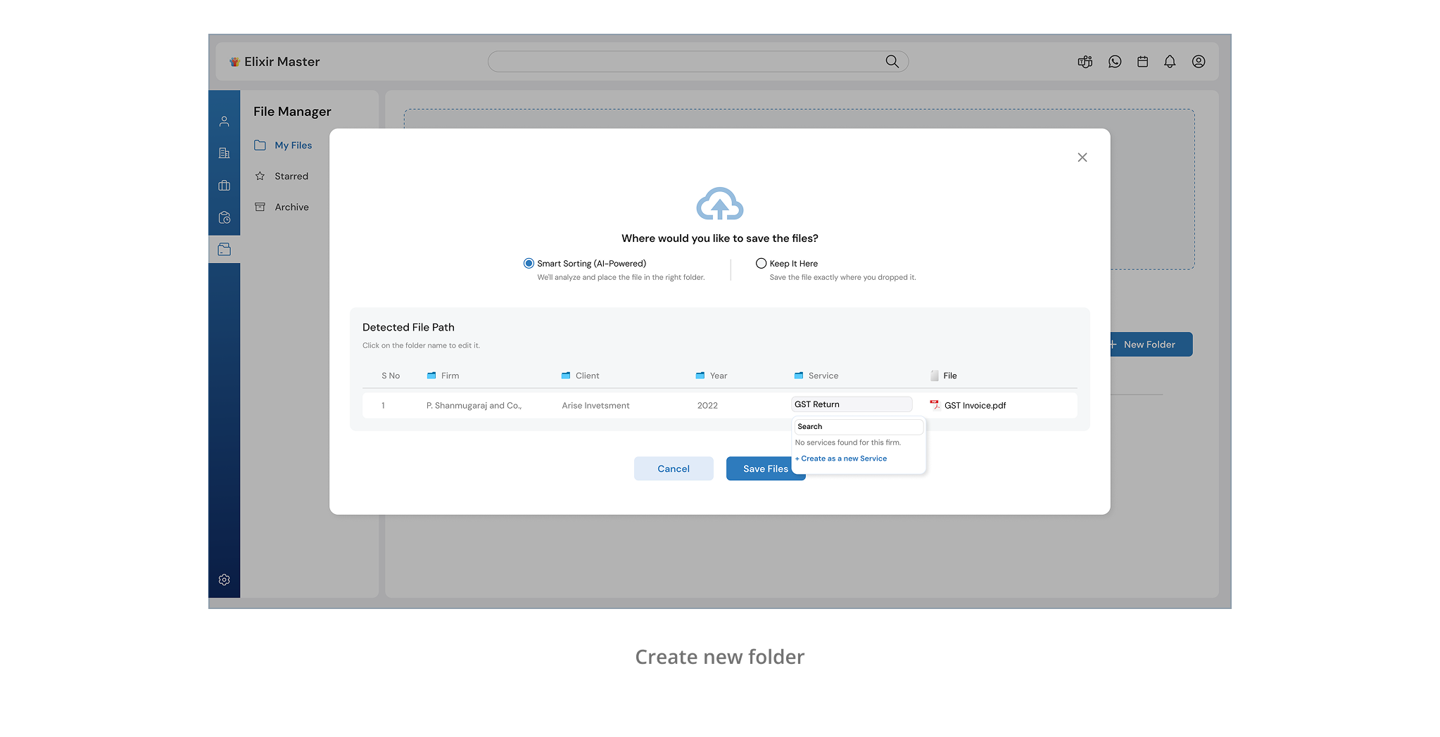
File Manager: Manual Mode for Power Users
Before:
The file system only offered AI-assisted folder placement.
After User Request:
We added an optional manual folder selection mode.
Why it mattered: While the AI worked great for most, users wanted full control. Now, they could override suggestions when needed.
These small shifts made a big difference, turning a great system into one that truly worked for every type of user.
The Impact
The real win was in how quickly the Elixir team adopted the tool with minimal onboarding and no confusion. Here's what they had to say:
"There was nothing to figure out. It just made sense."
"Now I can find a file, see who handled it, and know it's in the right place, all within seconds."
"The UI feels light. We don't have to think, we just work."
Across the board, the feedback centered around clarity, control, and time saved. From file uploads to task assignments, every interaction was easier, cleaner, and more connected.
Final Thoughts
This project reminded me of a simple truth: The best UX doesn't call attention to itself, it quietly empowers people to do their jobs better.Elixir Master wasn't about reinventing how they worked. It was about removing friction, stitching their systems together, and creating a single space where everything just… worked.
It taught me how to:
- Unite scattered workflows into one intuitive experience
- Make complexity feel effortless through structure and design
- Use AI as an assistive layer, not a disruptive one
Created with attention to detail, user-centered design, and a commitment to solving real problems.