 Back to my works
Reward Rally
Crafting a Loyalty Loop That Hooks and Retains
A plug-and-play loyalty system for e-commerce brands, featuring points, badges, tiers, and referral rewards, easily embedded on any website, including Shopify.

My Role
UX Research & Product Design

Duration
3 months

Team
VP Product Design, VP Business,
Business Analyst,
System Architect, 2 Developers

Impact
Flexible retention system
A Loyalty Platform That Didn’t Start With Loyalty
This one wasn’t born out of a client request. It started as a question from our CTO.

What if we built something to help e-commerce brands retain customers better?”
No client brief. No feature list. Just a blank canvas and the spark of a product idea. We knew loyalty programs existed, but many felt bloated, underwhelming, or disconnected from real user behavior.
We asked ourselves:
Can we design a loyalty system that feels personal, motivating, and... invisible when it needs to be?
That question became our north star. This wasn't about reinventing loyalty. It was about re-imagining how loyalty feels, for both brands and customers.
Mapping the Loyalty Loop: The First Whiteboard
The real journey began in a room with a whiteboard and a lot of sharp minds. In that first product thinking session, we had the VP of Design, VP of Business, System Architect, Business Analyst, and Marketing Lead all in one place.
 Design Principle
It wasn’t about building features yet, it was about understanding behavior. We didn’t start with what we could build. We started with what customers feel.
- What makes a customer come back?
- How do we make them feel remembered?
- How do we make rewards feel real and motivating, not like a corporate trick?
Adding UX Depth to the Loyalty Loop Conversation
While the whiteboard session was in full swing, filled with perspectives from different minds, I knew this couldn’t just be an idea-led product. It had to be a user-led one.
So I pulled in some fast but focused UX research to help shape the conversation.
Competitive Analysis: What Other Loyalty Tools Miss
I studied four existing loyalty products: Zinrelo, EasyRewardz, Graffit, and Xoxoday Plum, across three key dimensions: emotional resonance, brand flexibility, and clarity of user value.
| Competitor | Strengths | Weaknesses |
|---|---|---|
| Zinrelo | Full-featured loyalty engine, supports omni-channel, Indian support team | Complex setup, generic UI, expensive for small D2C brands |
| EasyRewardz | Popular in retail, connects loyalty with CRM & POS | Built for enterprises, not D2C-friendly, lacks emotional UX |
| Graffit | Strong in employee rewards, supports bulk reward disbursals | Not built for customer loyalty specifically |
| Xoxoday Plum | Great for reward distribution, large brand catalog | Not a loyalty loop, lacks gamification and customer tiering |
Most platforms emphasize functionality and backend integrations, but lack the emotional, gamified experience layer that builds long-term retention.
Reward Rally fills that gap, it's built for D2C brands who want a plug-and-play loyalty engine that looks, feels, and performs like their own.
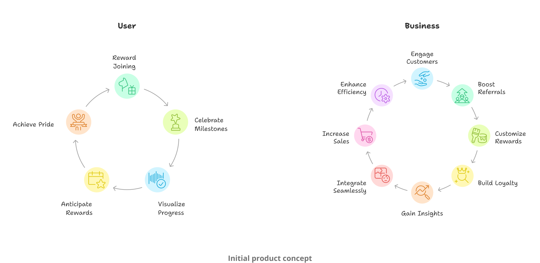
Earning Points: The First Hook
Everyone agreed: loyalty can't start and end with purchases. Points for purchases were a given, but what about all the in-between moments?
We made a list of all the positive behaviors we wanted to encourage
- Purchasing something
- Referring a friend
- Logging in regularly
- Celebrating birthdays or anniversaries
- Leveling up through continued engagement
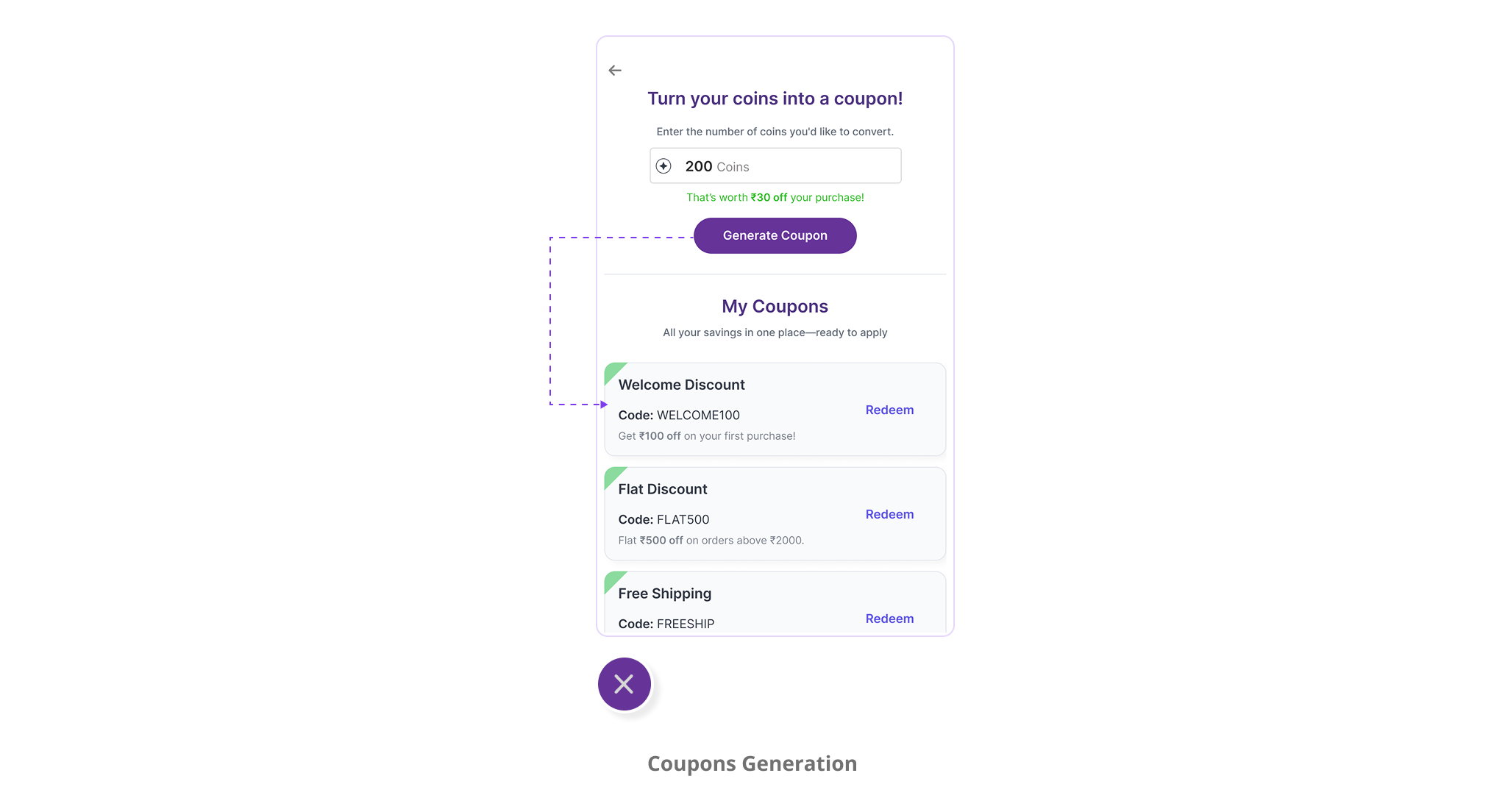
Redemption Without Friction
Next came the conversation around redemption. We didn't want to throw points at people without a clear way to use them. So we debated: Should points auto-apply? Should there be fixed thresholds? Should people "spend" their points or just passively benefit?
Let's make users explicitly convert their coins into coupons.
Psychology Behind the DecisionThis wasn't just about mechanics, it was psychological. We wanted it to feel like users were "taking it out of their pocket" and making a deliberate choice to spend.

Levels and Badges: Loyalty as a Journey
When we presented this idea to the CTO, the discussion took a sharp, exciting turn. He asked:
What happens after a user redeems once? What keeps them coming back?
That's when the idea of Tiers and Badges came up. We decided to build a loyalty system that felt like progress. Something visual. Something motivating. Like climbing a ladder, unlocking achievements as you go.
- Bronze
- Silver
- Gold
- VIP
Design ShiftThis shift, from transactional rewards to emotional progress, was a turning point in our design journey.
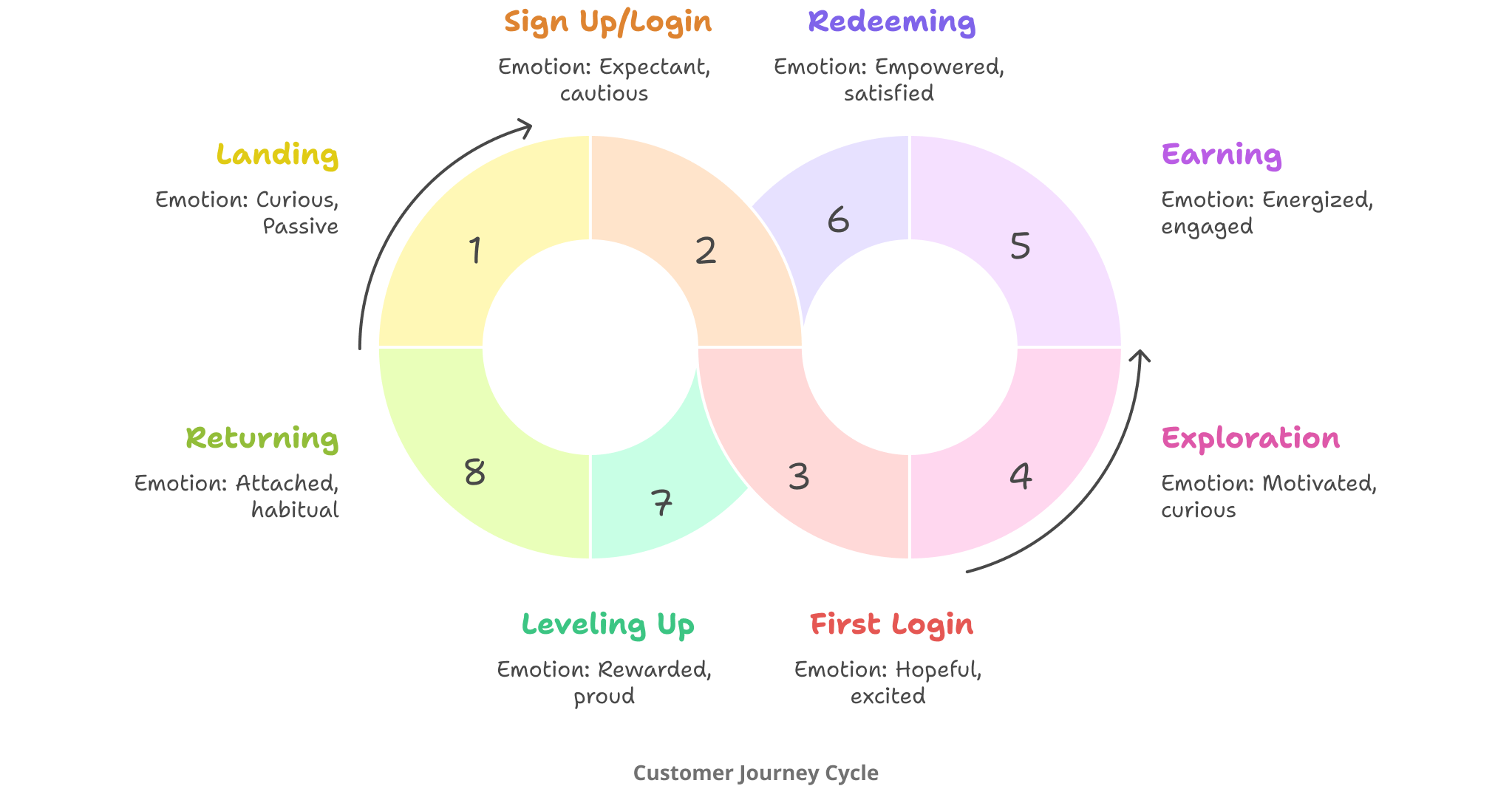
To ground our design thinking in behavior, I mapped out the end-to-end customer journey. I looked at how users feel at each step, not just what they do.
The Core Feature Set, Finalized
Once the vision was solid, we locked in the final experience:
 Earn Points
referrals, level-ups
 Coin Conversion
 Voucher Redemption
 Tier Levels
Make this experience feel delightful for the customer, and manageable for the brand.
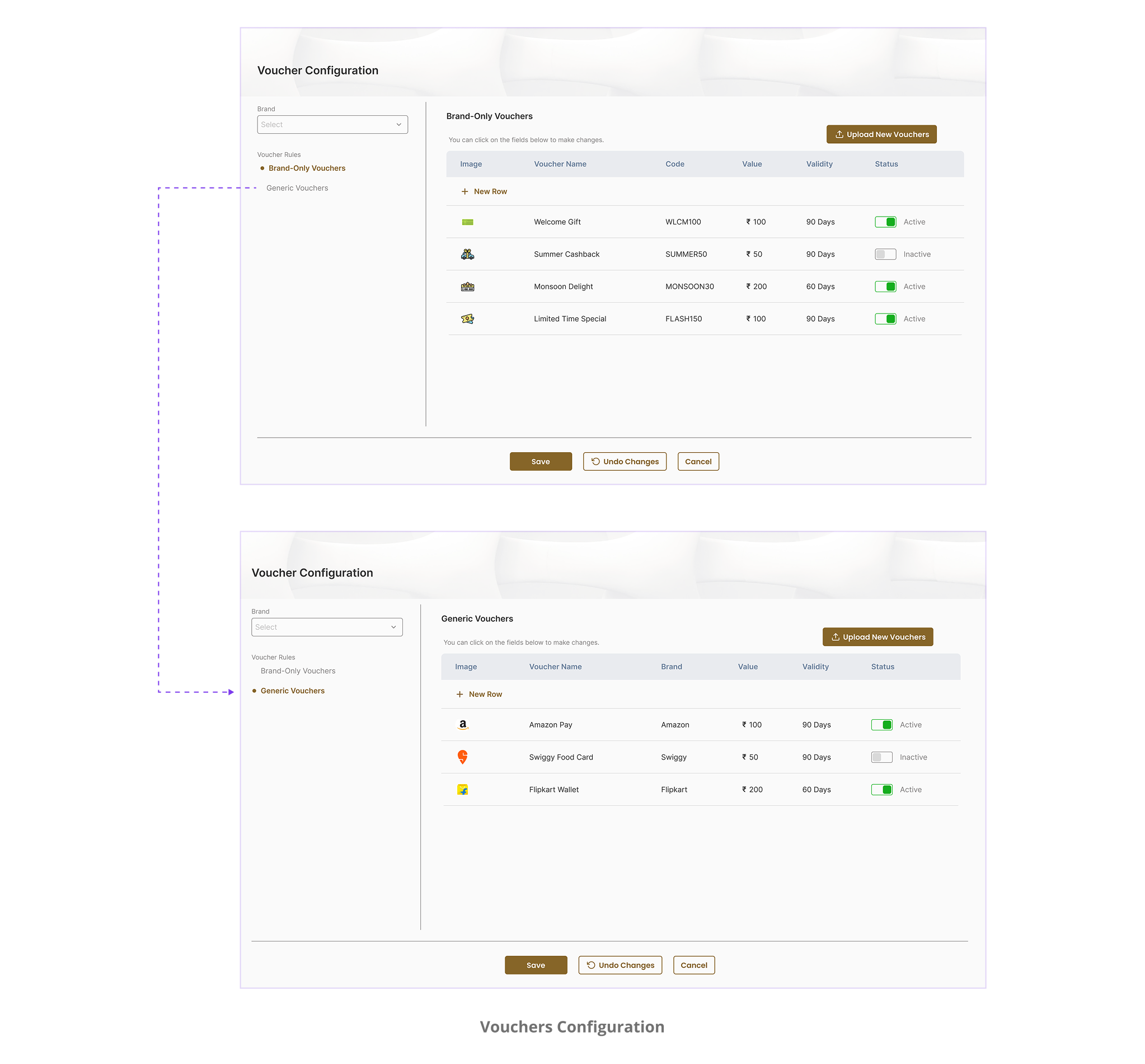
Designing the Admin Experience
Dashboard
Overview of active users, coins earned/redeemed, referrals, and top tiers.
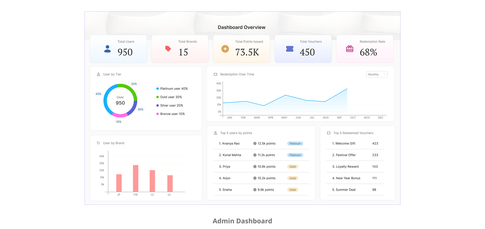
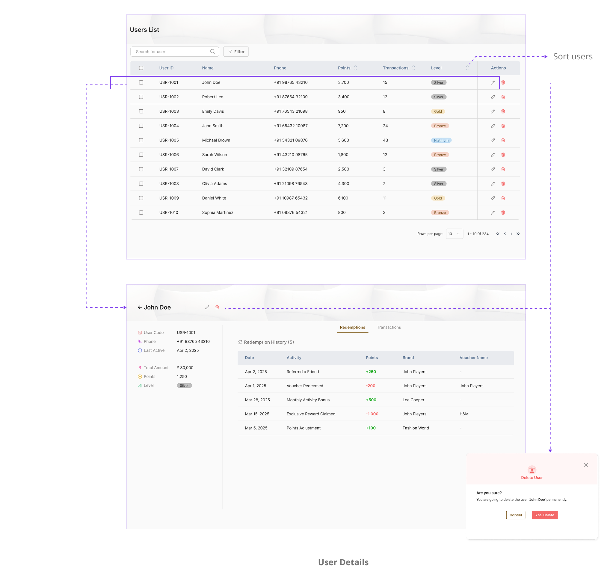
User List
View, edit, or delete users. See tier, points, referral status, and engagement.
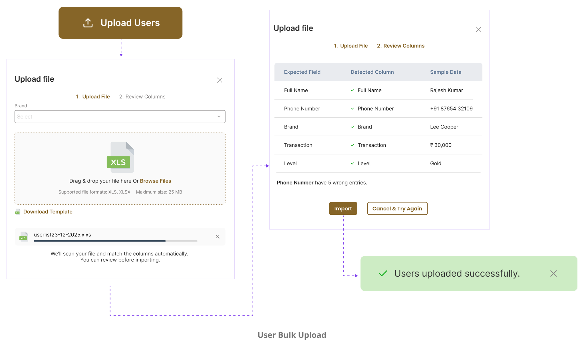
Bulk upload
users into the system via CSV/Excel import to support omnichannel.
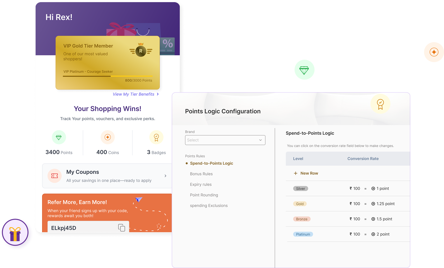
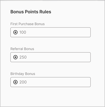
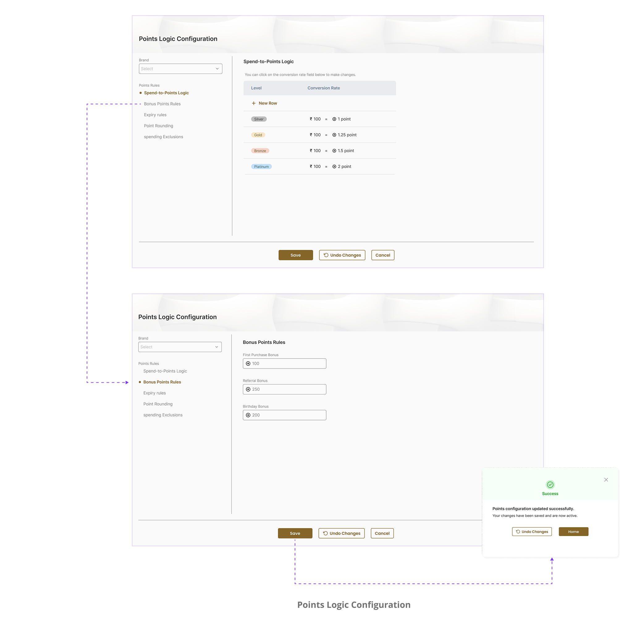
Points Logic
Rule-builder to define how users earn points (logins, purchases, birthdays, etc.).
Vouchers
Add both custom brand vouchers and popular general vouchers (Amazon, Swiggy, etc.).
The Shopify Challenge: Turning a Constraint into a Feature
One of the challenges I faced came when our first client, an e-commerce brand on Shopify, came onboard. Shopify, as a platform, is notoriously restrictive when it comes to UI customizations.
I realized we couldn't inject loyalty blocks into multiple sections of the storefront the way we initially imagined. Every placement idea I explored, homepage banners, account pages, product pages, felt either forced or buried.
What if the loyalty program didn't live in a section… but followed you like a quiet assistant?
That's how the Floating Gift was born.
My Design Thinking Behind It
I designed it as a small, animated gift icon that subtly sits in the corner of every screen, always visible, but never in your way.
I wanted it to feel alive, so I added a gentle bounce animation to give it personality. Just enough movement to catch the eye without being distracting.
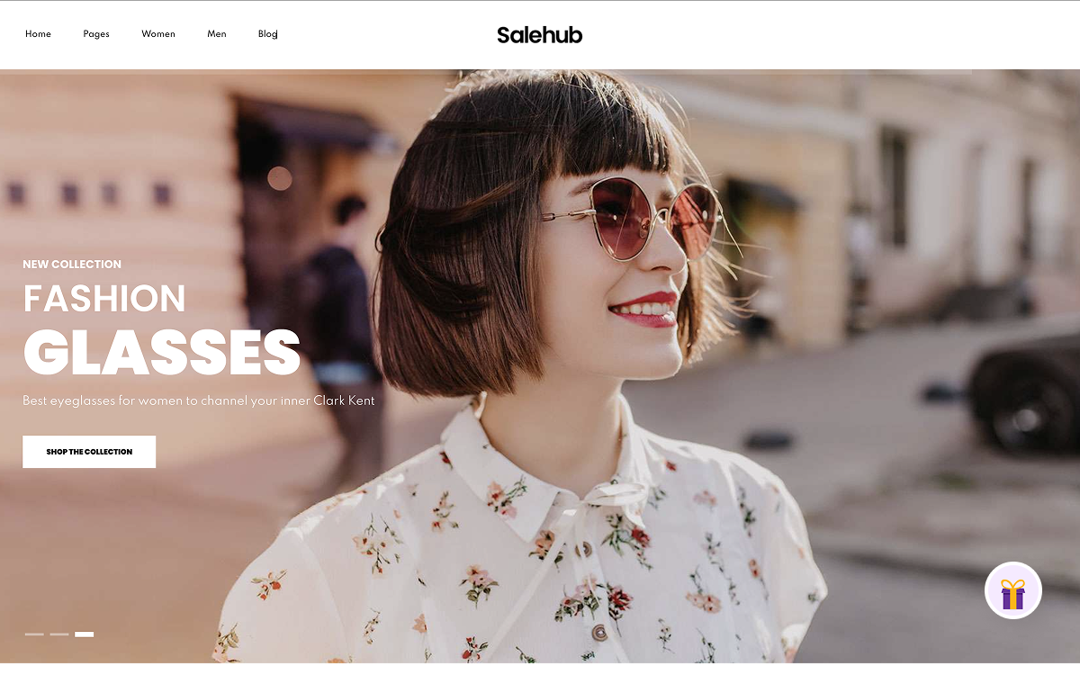 UX Breakthrough
This gave us something powerful: a persistent entry point to the entire loyalty experience, without breaking any Shopify rules.
Pre-Login: Designing the Tease
Before a user logs in, the drawer opens with a light touch, no overwhelming screens, just curiosity. I designed the drawer to feel like a sneak peek:
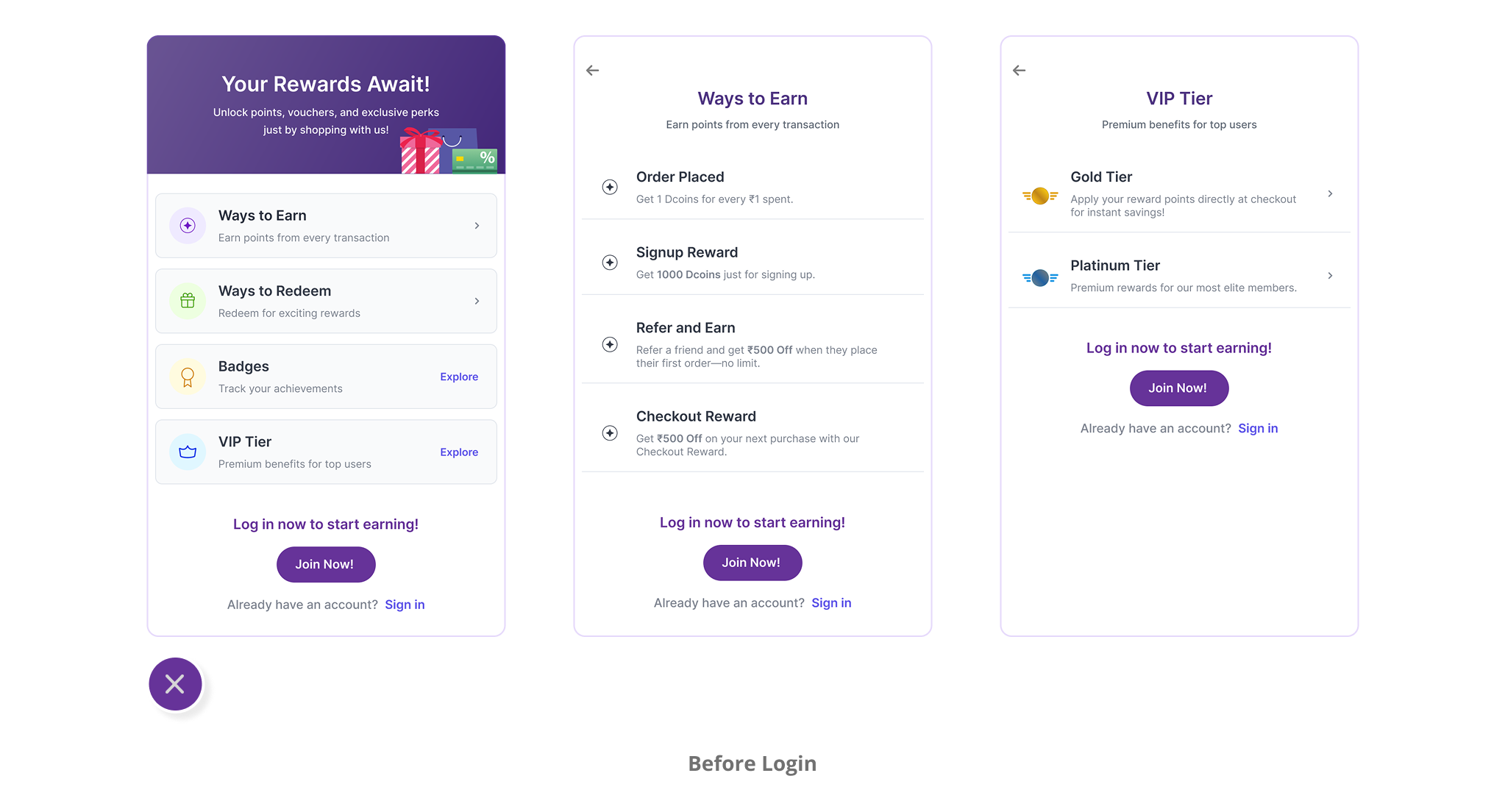
Post-Login: The Mini Loyalty Dashboard
Once logged in, that same Floating Gift transforms into a fully functional loyalty control center, compact, rewarding, and always within reach.
The First-Time Flow: Referral Comes FirstOn the user's first post-login visit, the drawer doesn't just show the main dashboard. Instead, it starts with the Referral screen, right upfront. Why? Because if a customer already has a referral code, this is the perfect moment to use it.
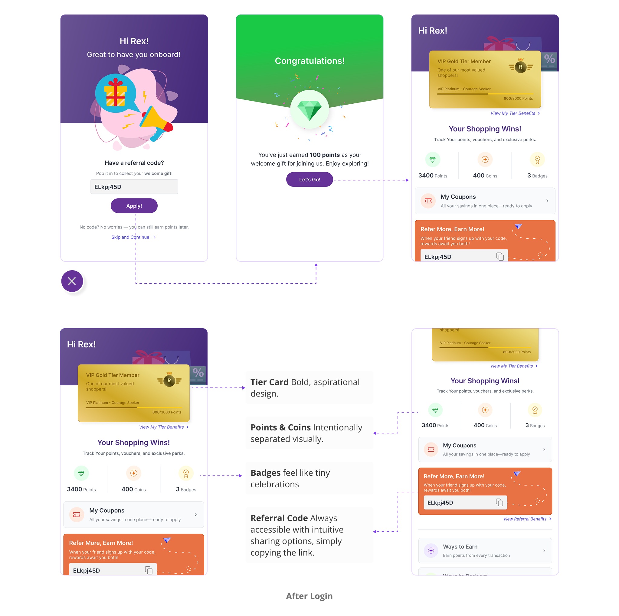
Designing for Trust & Clarity
Ownership builds loyalty.
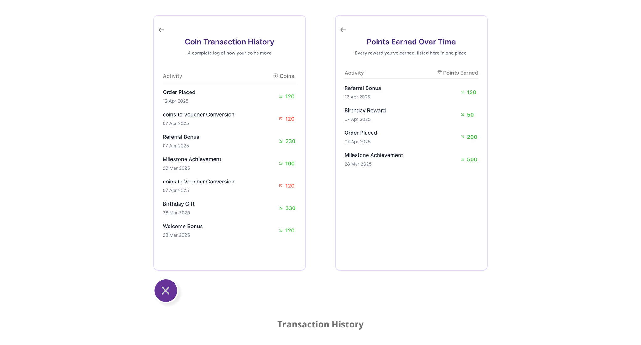
While shaping the user experience, I kept coming back to one important principle: ownership builds loyalty. So I designed key elements, coupons generation, points History, coins history, to give users clarity, control, and confidence in how Reward Rally works:
Transaction History
Like a Banking App
Loyalty points can feel abstract if users don't know where they're coming from or going. To make it real, I designed a bank-style transaction log.
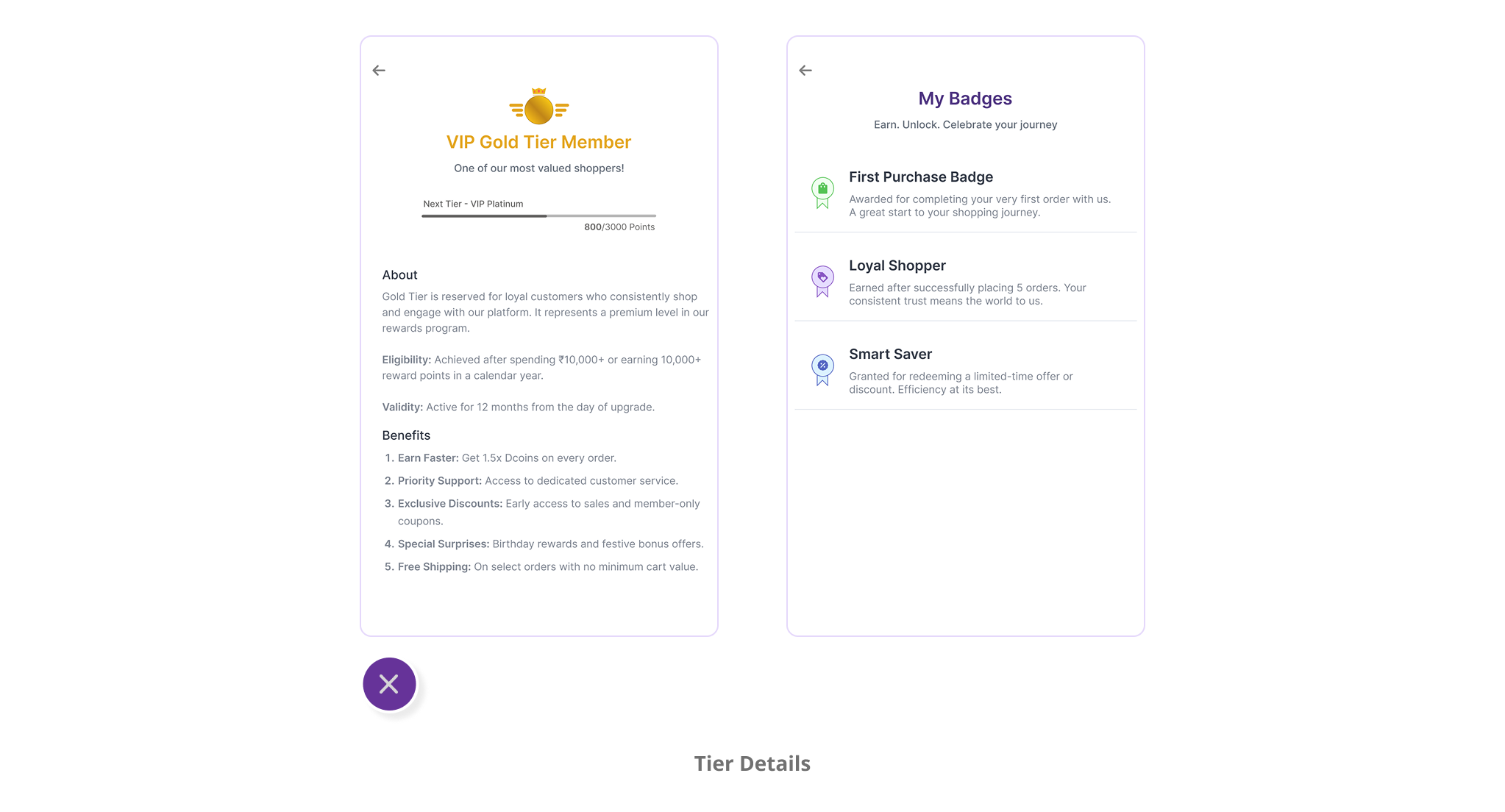
Tier Detail View
Each tier promised different benefits, but how would users know what they're actually working toward? So I designed a dedicated detail view for each tier.
The Impact
Clients loved how lightweight and universal the Floating Gift felt. It didn't hijack their layout, yet it gave customers full access to the loyalty experience from any page.
 Key Learning
For me, it was a reminder that some of the best product ideas come not despite constraints, but because of them.
The key was designing for behavior first, then building the features around those behaviors. By focusing on how loyalty actually feels rather than just how it functions, we created something that brands could truly customize while users could genuinely engage with.