 Back to my works
 Reports were taking hours. Users couldn't afford to wait, so days were lost to manual workarounds.
Subscriber Management System (SMS)
Untangling Complexity for Millions of Subscriber Data
A desktop application for managing subscribers, STBs, and LCO data, built for a cable TV provider under TRAI compliance.

My Role
Heuristic Evaluation
UX Research
Product Design

Duration
9 months

Team
Business Analyst
System Architect
7 Developers

Impact
Scalable Subscriber Operations
Trustworthy Workflow System
About the Client

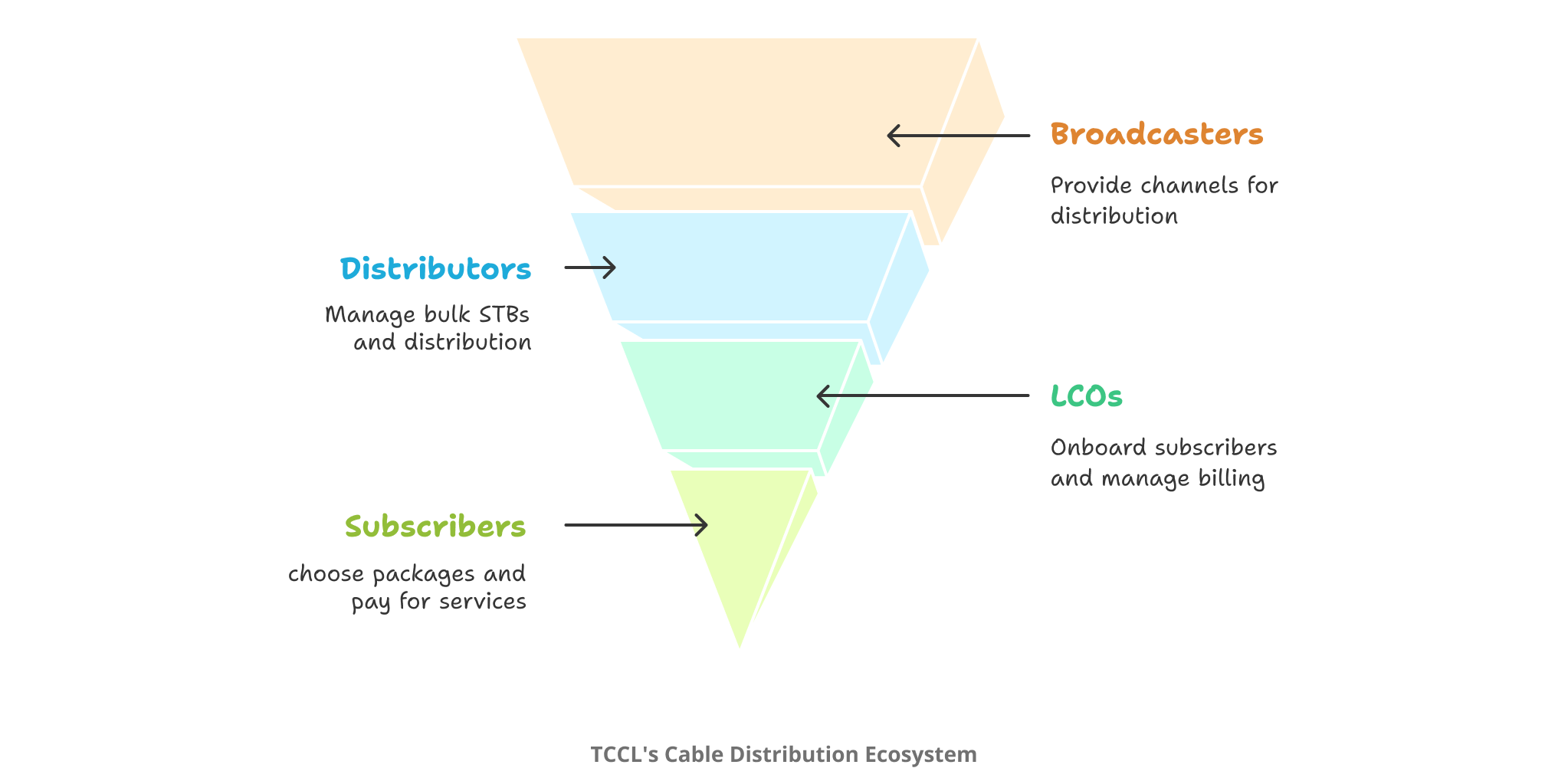
A Broadcasting Giant with a Layered Ecosystem
TCCL (Tamil Nadu Cable TV Operators) manages cable distribution across India. They partner with broadcasters, convert channels into packages, and rent them to subscribers via Set-Top Boxes (STBs). Their subscriber base? Over 2 million users.
Their model involves a complex hierarchy:
- Distributors / Sub-distributors manage bulk STBs.
- LCOs (Local Cable Operators) onboard subscribers.
- Subscribers choose packages or individual channels.
Each LCO is a business partner. Commissions flow back based on subscriber activation. Add monthly billing, package upgrades, real time activations, and a need for detailed audit reports.
Why They Came to Us
TCCL's existing Subscriber Management System (SMS) was breaking under its own weight.

We'd click a button and just pray. There was no way to know if anything was actually happening in the background.
The breakdown led to chaos. People stopped relying on the software and started doing everything manually. It was messy, stressful, and slow.
At some point, we stopped trusting the system.
They didn't want a patch. They wanted a complete rebuild. Something scalable, intelligent, and intuitive. Something that would make sense of the chaos and give them confidence in every click.

We didn't just need a better tool. We needed clarity. We needed control.
Listening First, Then Mapping
I spoke to the admin and managers who handled SMS. I audited the old system's user flows and performance logs. I shadowed real subscriber onboarding and billing workflows to understand how things really worked on the ground.
And I learned quickly.
When reports were slow, days were lost. Without real-time feedback, users were left guessing. The UI was inconsistent, so people resorted to manual workarounds. Financial tasks had no guardrails, it was risky and exhausting.
Heuristic Evaluation
A comprehensive analysis of user experience challenges and design recommendations for improving information update workflows
User Personas
 Daily Patterns
 Daily Patterns
Understanding our primary users and their unique challenges in the SMS system workflow
Ramesh Kumar
SMS AdminWhen I click a button, I want to know it worked, without having to call three people to confirm.
- Starts day reviewing pending subscriber activations
- Relies heavily on reports for billing and compliance checks
- Multitasks across calls from LCOs, troubleshooting STBs
- Reports take hours, delaying billing
- No clear feedback when actions succeed or fail
- Struggles with inconsistent UI across modules
- High stress from risk of errors in financial tasks
- Fast, reliable system that provides real-time status
- Transparent reports for billing and compliance
- Clear feedback when actions succeed or fail
- Comfortable with desktop tools (Excel, Outlook)
- Not highly technical; prefers simple, guided workflows
Meena Raghavan
Local Cable Operator (LCO)I need to finish onboarding of subscribers in one go.
- Spends mornings onboarding new subscribers
- Collects monthly subscription fees
- Frequently contacts regional admin for package activations
- Confusion over multiple modules for onboarding
- Difficulty tracking payment histories in real time
- Dependent on admins for tasks that could be self-service
- Stress from handling subscriber complaint
- Simple, user-friendly interface
- Clear subscriber onboarding and STB status checks
- Self-service capabilities to reduce dependency on admins
- Not highly technical; prefers simple, guided workflows
- Prefers guided flows and auto-fills over manual entries
Key Findings
While the system does offer a wide range of functionalities, users might encounter challenges due to its
- Intricate interface design causing user confusion
- Extended loading times impacting user patience
- Lack of cohesive design aesthetics
- Absence of logical grouping for seamless navigation
- Inadequate error prevention measures
- Missing helpful documentation resource
Design Recommendations
To enhance user experience and encourage timely information updates via SMS, the following design objectives can be considered in the redesign
- Simplicity - Minimalistic Approach
- Consistent design
- Powerful Search
- Deal with mistakes immediately
- Error preventive measures when possible
- Implementing help document
These design objectives should be prioritized to enhance user experience and encourage timely information updates via SMS, creating a more intuitive and efficient system.
What I Discovered and How I Broke It Down
After speaking to admins, shadowing billing workflows, and digging into the system logs, a few patterns stood out loud and clear:
Painfully Slow Reports
No Real-time Feedback
Users were left guessing if an action went through or not, creating confusion and repeated steps.
Inconsistent Interface
Each module worked differently, forcing users to develop their own hacks and habits just to get things done.
Zero Financial Guardrails
High-risk actions like refunds or billing ran without confirmation. One click, and done. No prompts. No logs.
Building the Brains of the System
 Psychology Behind the Decision
I wasn't just designing features. I was orchestrating a system that could keep 2 million accounts in sync, without breaking a sweat.
Once I had a clear view of the pain points and priorities, I broke SMS into 12 modular, manageable brains: Dashboard (Home), STB, Users, Payments, Subscribers, Products, Broadcasters, Complaints, Reports, TRAI, Settings and Profile.
Each one had a clear purpose, but they all needed to work together seamlessly. This approach helped me design a system that was both scalable and intuitive. No chaos, no confusion, just smooth operations.
Backend as the Backbone
A good frontend is only as good as the backend it leans on.
To make sure the experience stayed smooth even under the weight of millions of records, I closely collaborated with the system architect to get the foundation right.
We restructured the database to reduce relational overhead and added lazy-loading to keep searches lightning-fast, users could start typing, and we'd only fetch what was needed.
For heavier actions like downloads, we introduced a queuing system that shifted the load off the main thread, so the rest of the app didn't slow down.
That backend work made all the difference. The system stayed responsive, even at scale.
Designed in Loops, Not Lines
I approached the design in tight, iterative loops, not straight lines.
I had weekly check-ins with stakeholders to stay aligned and gather feedback early. I shared prototypes as soon as possible so real users and teams could interact with them, not just look at pretty screens.
Every step of the way, I worked closely with both frontend and backend developers, syncing regularly to stress-test the flow and catch friction points before they became real problems.
This way, the product didn't just evolve for the users, it evolved with them.
Designing the Beast
Focusing on What Mattered Most
While the Subscriber Management System (SMS) had over 12 complex modules and countless features, I've chosen to highlight only the most impactful parts of the system here. These features represent the highest UX value, where design directly improved performance, clarity, and user confidence at scale.
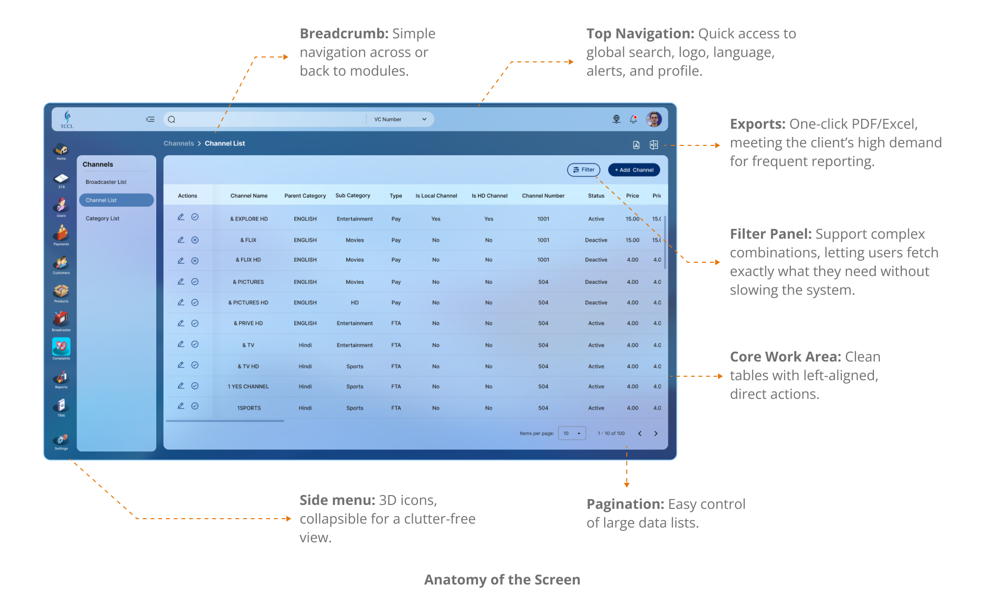
Crafting a Cohesive, Predictable Interface
Before diving into specific UX wins, I focused on setting up a strong, consistent foundation across the entire product, something that would reduce cognitive load and help users build familiarity quickly, no matter which module they were in.
Key UX Solutions
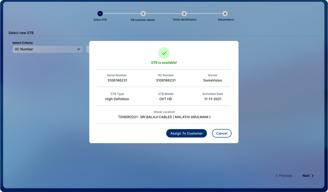
Disconnected Onboarding Flow
ChallengeOriginally, onboarding a new subscriber was a fragmented experience. After entering subscriber details, users had to switch to the STB module to assign a device, and then again navigate to add channel packages, all as separate steps. This led to confusion and incomplete onboarding.
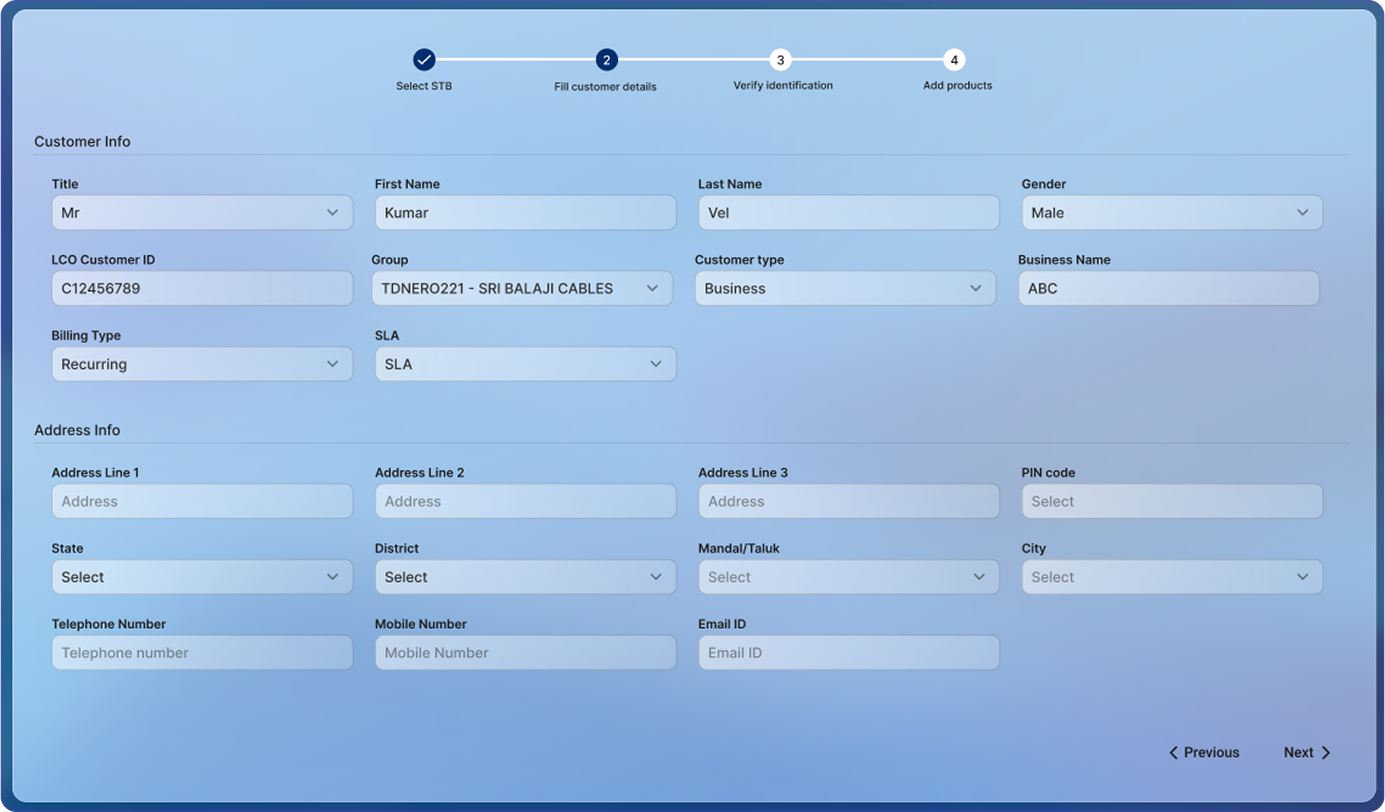
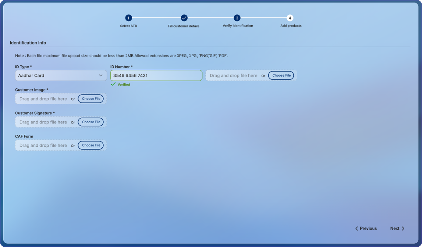
My SolutionI created a unified, wizard-style onboarding flow.
Step 1 Select STB: Choose an available STB, validating it’s not already assigned.
Step 2 Enter Subscriber Details: Fill in key subscriber info like name, contact, and address.
Step 3 Document Upload: Upload mandatory KYC or ID documents for compliance.
Step 4 Optional Package Assignment: Assign a base package if needed, or skip for later.
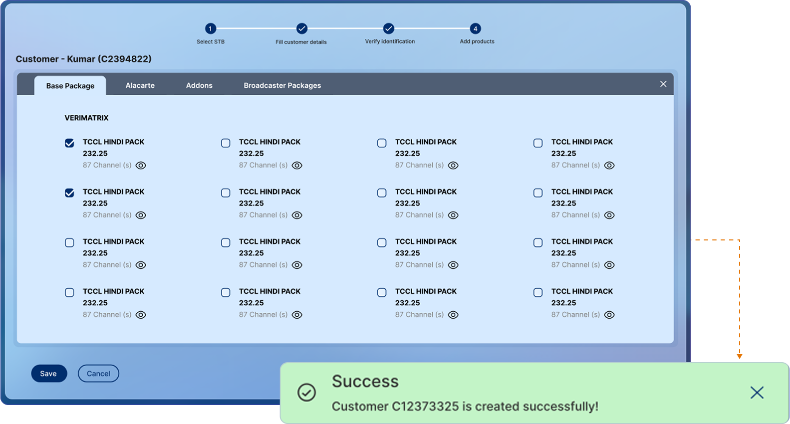
This allowed users to complete the entire onboarding (subscriber + STB + packages) in one go, without feeling overwhelmed.
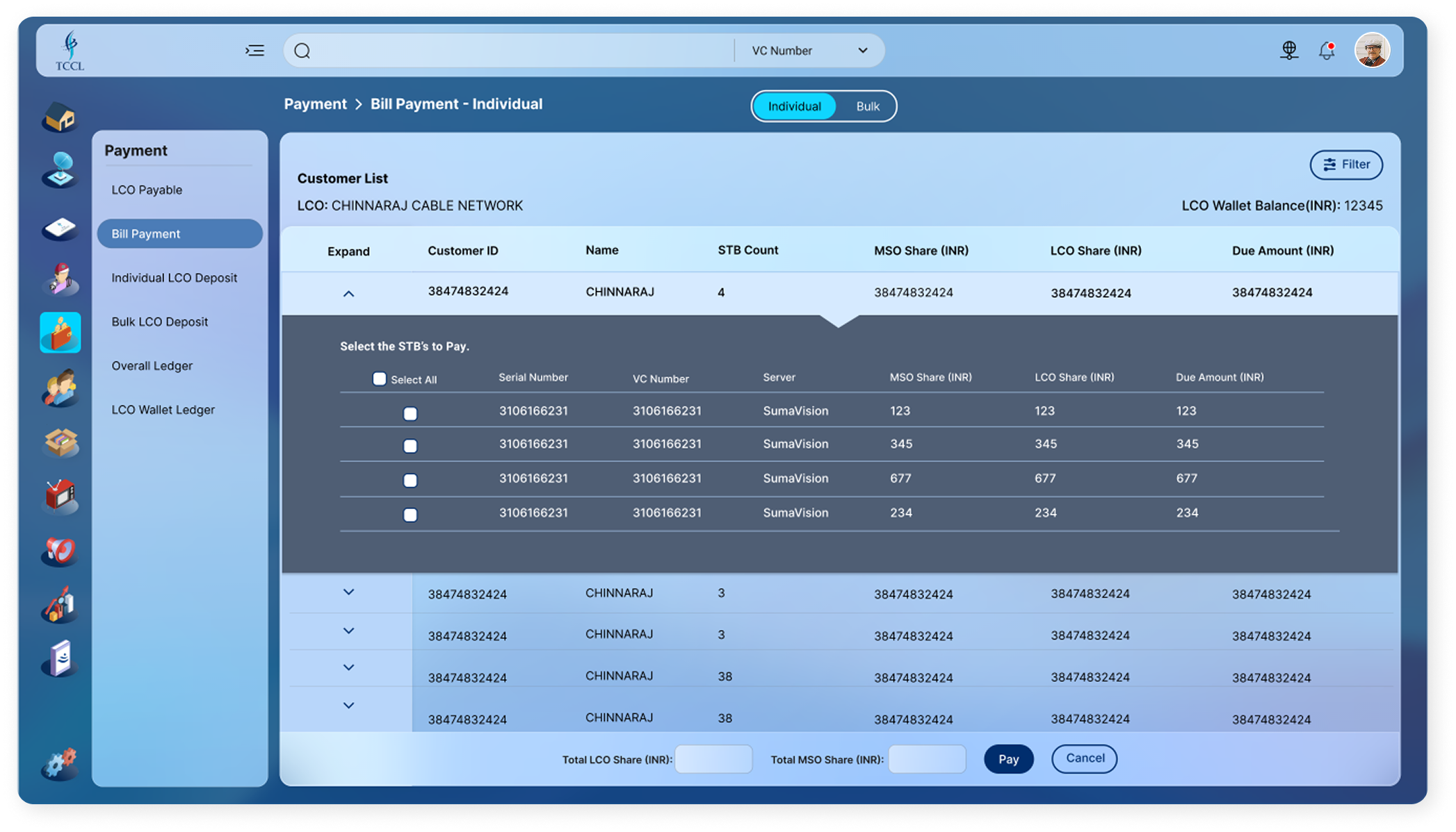
High-Stakes Financial Actions, No Safety Nets
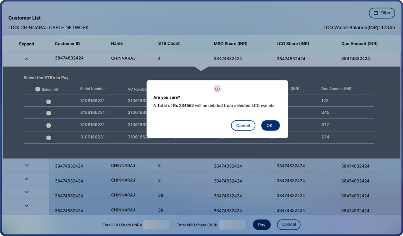
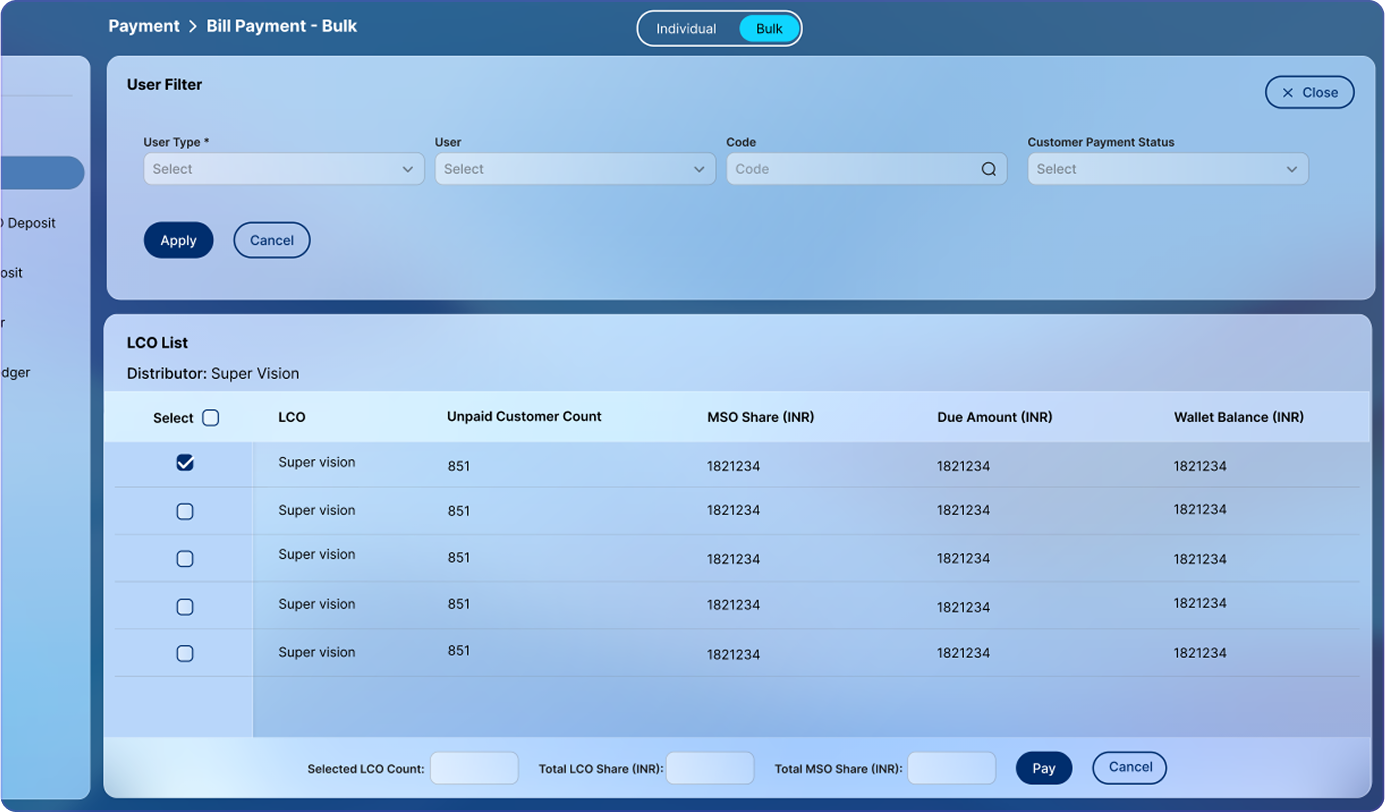
Challenge The payment process was hectic and error-prone. Selecting STBs was tedious due to poor filters and lack of effective search. There were no confirmation prompts, which led to accidental payments. Worse, admins had to manually calculate the MSO and LCO share before proceeding, making the entire flow time-consuming and prone to mistakes.
My SolutionI redesigned the payment flow with advanced filters and quick search to make STB selection effortless. Clear MSO-LCO share breakdown and a confirmation prompt ensured accuracy and confidence before completing payments.
Step 1 Filter & Select LCO: Admins can quickly filter and choose the relevant LCO to narrow the list.
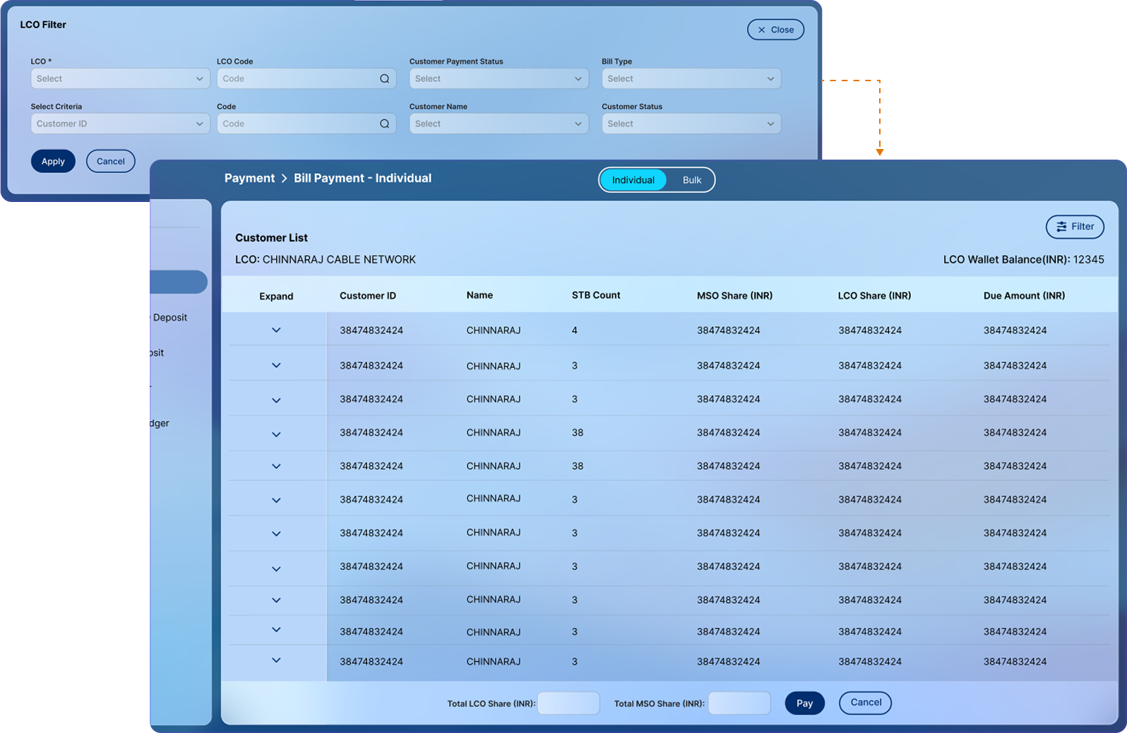
Step 2 Select STBs: All associated STBs are listed with a clear split of MSO and LCO amounts, reducing ambiguity.
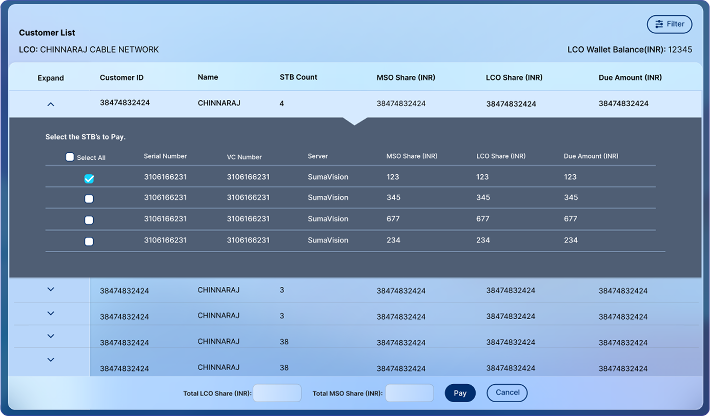
Step 3 Confirm & Pay: A confirmation prompt ensures double-checking before deduction. Once confirmed, STB statuses update and LCO wallet is debited.
Step 4 Bulk Payment Support: For speed, the system allows paying for all subscribers under an LCO in one click.
This flow minimized errors, improved transparency, and significantly sped up the payment process.
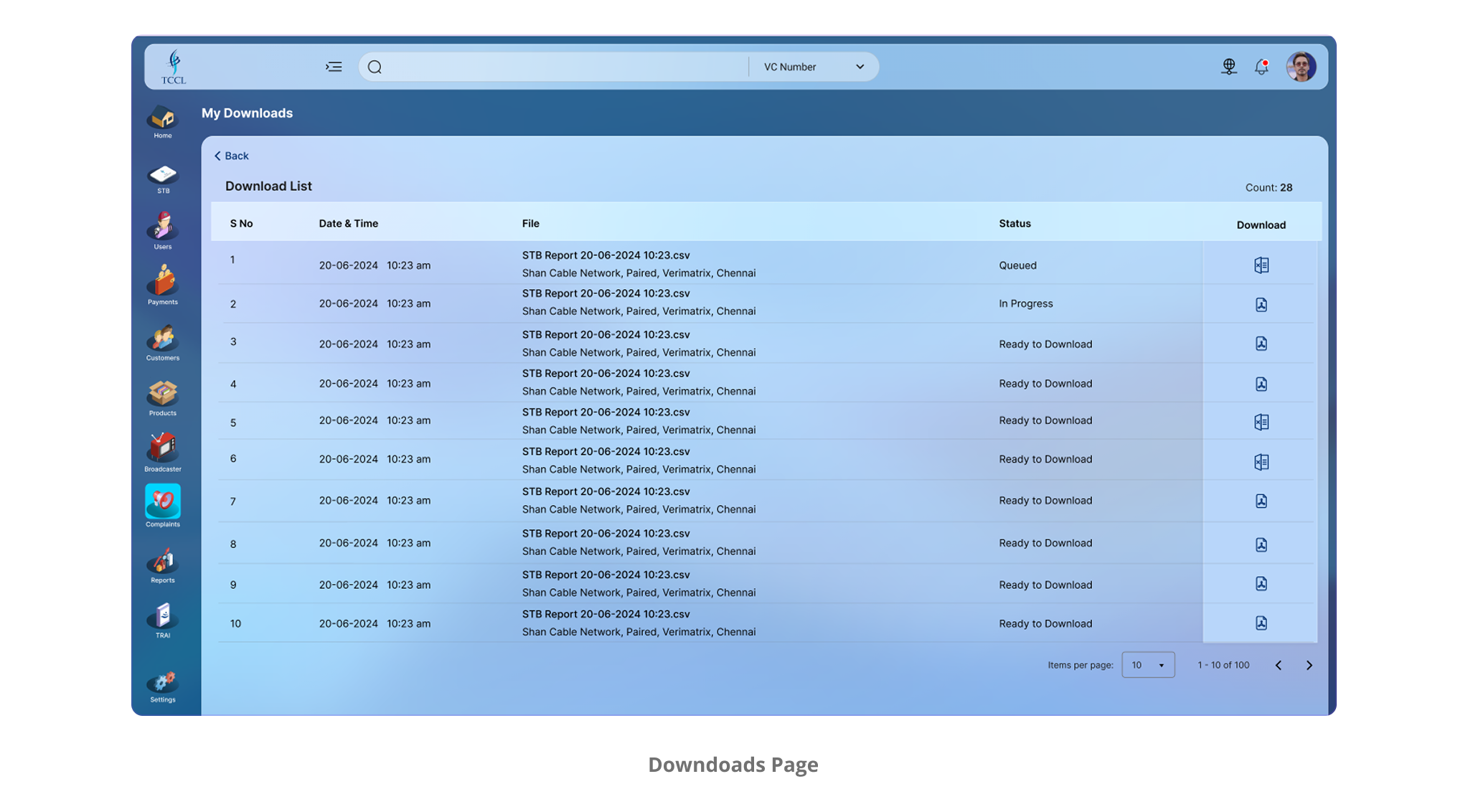
The Download Nightmare
Challenge Users used to start a download and then... wait. Everything else froze.
My SolutionI added a dedicated 'Downloads' section inside the profile menu. It shows a clear status for each file, queued, processing, or completed, in real time. This lets users track downloads easily, continue using the system while files process in the background, and avoid unnecessary interruptions.
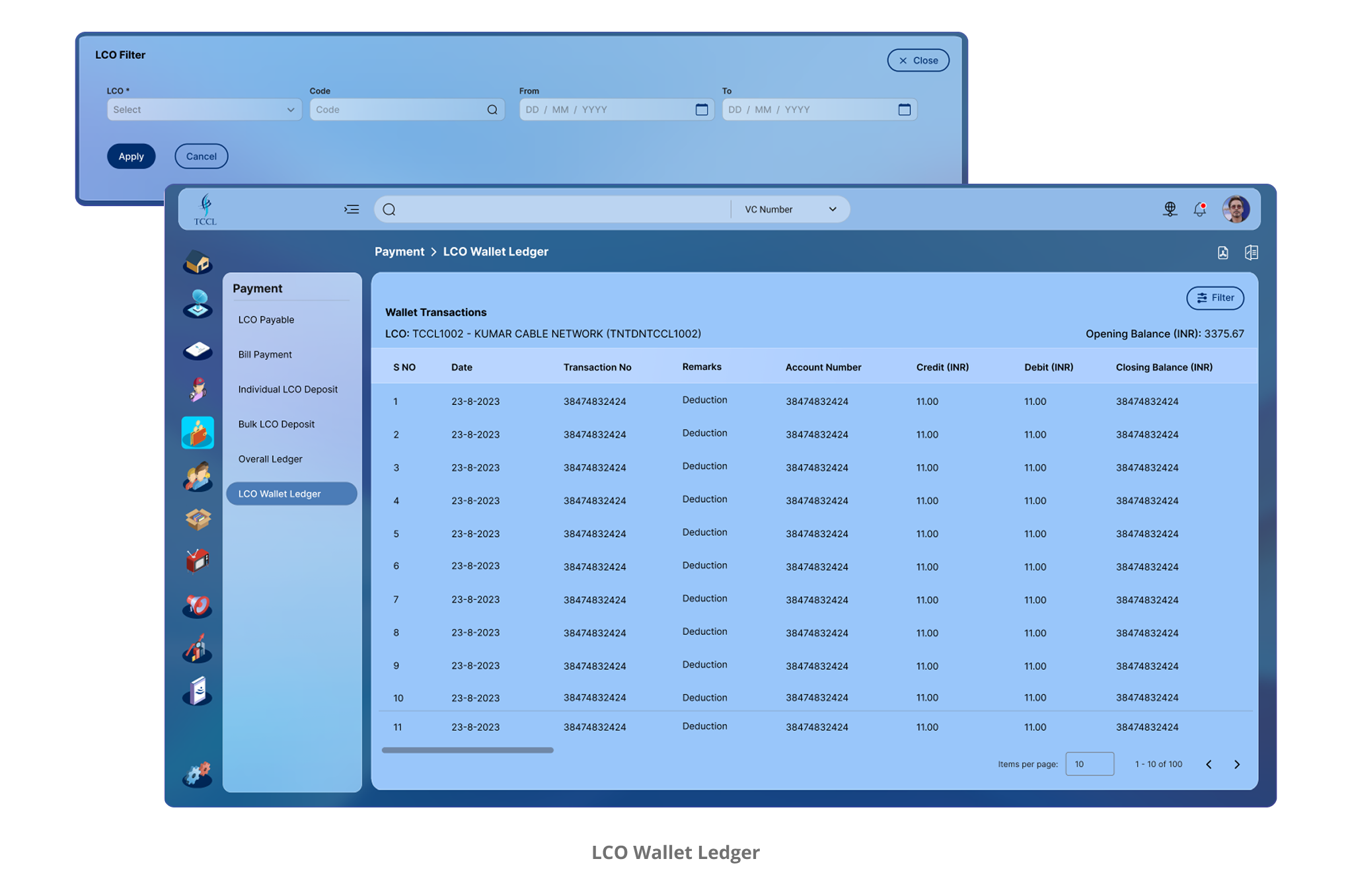
Money Flow Without the Guesswork
Challenge Admins had no clear, consolidated view of the LCO wallet’s cash flow, making audits time-consuming and reducing transparency in financial tracking.
My SolutionI designed the LCO Wallet Ledger to display opening balance, closing balance, and all transactions in between, letting admins spot the day’s financial position at a glance. Built-in PDF/XLS exports allow instant reporting, improving audit speed and financial transparency.
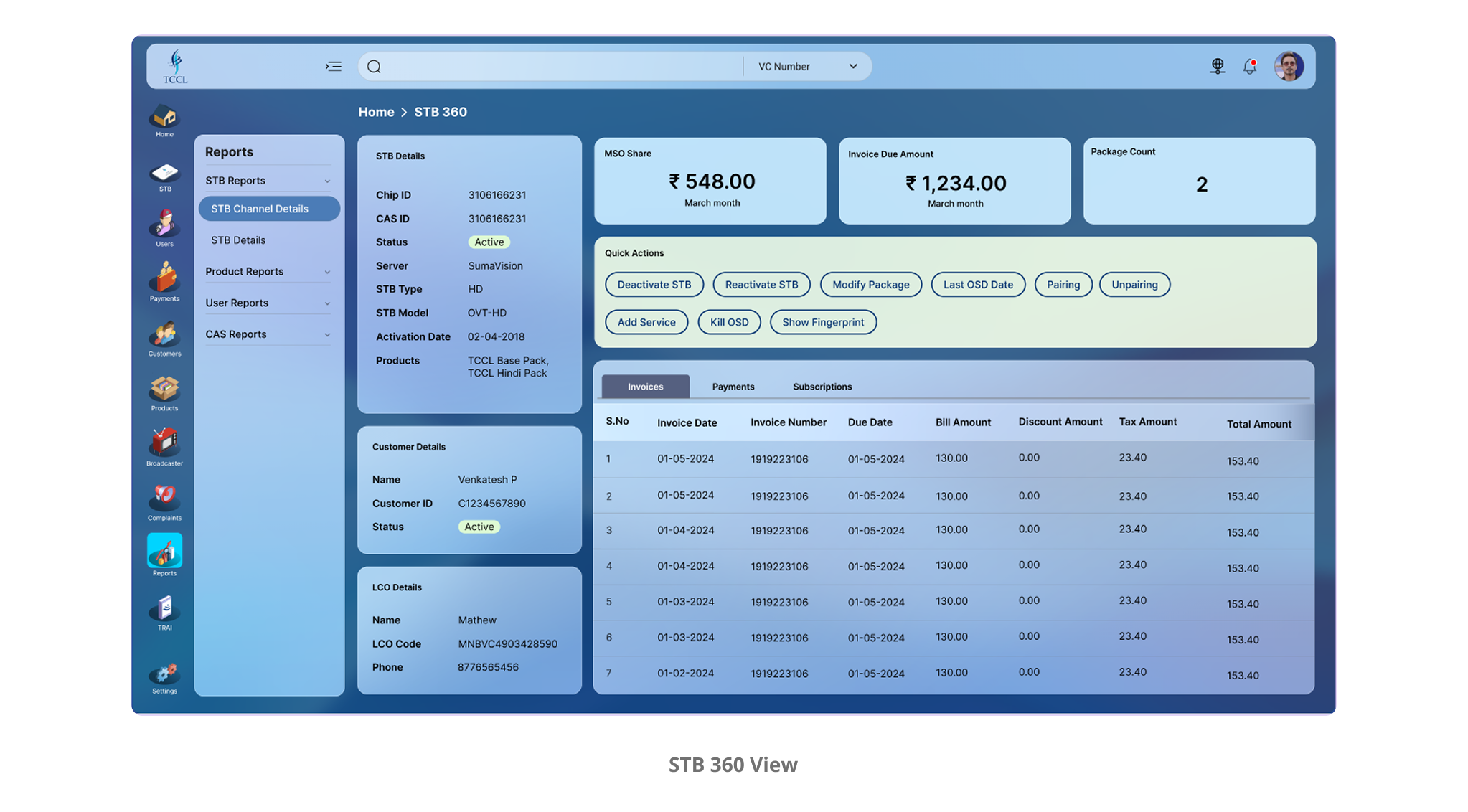
One Device, Scattered Data
Challenge Accessing complete details for an STB required multiple searches and manual cross-checks, making the process slow and effort-intensive.
My SolutionI introduced an STB 360° view accessible from anywhere in the app via global search. By entering the STB’s VC or serial number, users instantly see subscriber info, LCO details, billing history, packages, and more, all in one place for instant clarity.
Small Wins That Made a Big Impact
Sometimes it's the little design choices that earn the loudest praise.
Here are a few details the client genuinely appreciated:
- Global search that actually worked, quick, responsive, and always accessible
- Clear status indicators during actions, removing the anxiety of "Did that even go through?"
- A rock-solid system that stayed fast and responsive even under massive data loads
- Smart filters that simplified data instead of overwhelming the user
- Download queue, so admins could keep working while large files processed in the background.
- LCO Wallet Ledger with transparent cash logs, making audits effortless with a clear view of opening and closing balances.
- One-click PDF/XLS downloads for instant exports of any list or ledger without breaking workflow.
From Frustration to Flow
When we launched SMS, everything changed.
And the feedback that meant the most to us:
This redesign completely changed how we work. What used to take hours and endless calls now happens in minutes. The system feels intuitive, stable, and designed with our real needs in mind. For the first time, it feels like we're in control, not the other way around.